’19
Zumba® Fitness ClassBuzz

Self-promotion, without the design work

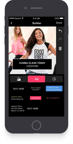
A one-stop mobile app that lets Zumba® instructors promote themselves on social media with custom-branded assets.

RoleLead UX / UI, Research
Timeline2019
PlatformsiOS + Android
CompanyZumba® Fitness
Design ToolsSketch, Figma, pencil & paper
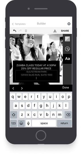
ClassBuzz app screens
Overview

Why did we make this?

  • Zumba® instructors rely on self-promotion to fill their classes
  • The traditional Zumba® marketing toolkit is mostly catered to print and only accessible at Zumba.com
  • Instructors weren’t sure which Zumba® logos and branded assets they were allowed to use
Discovery

Exploring the problem space

To kick things off we had a discovery meeting, during which we explored the challenge, discussed the data we'd need, and came up with an initial hypothesis for the feature set.

Initial Feature Hypotheses

  • Share on multiple platforms
  • Video clips
  • Schedule post
  • Custom Zumba filters / animations / glyphs
  • Class info from database
  • Music integration / clips / filters
  • License / specialty customizations
  • Zumba gallery of images / memes / quotes
  • Text editor
  • Upload / take photos with device
  • Quick tips / onboarding flow
  • Password-free first-time login
  • Strong SYNC network integrations

Research Plan

Surveys & Interviews

Analyze ZIN (Zumba Instructor Network) surveys & business insight reports for trends and requested features.

Benchmarking

Perform a competitive benchmark of social media creation and publishing products.

Design Sprint!

Host a 2-day design sprint to jump-start the project, align on goals, and shape a feature set grounded in user needs.

Research

Instructors were already promoting themselves, the hard way

The product manager on the project and I ran user surveys and in-depth interviews with instructors, then synthesized the findings into the patterns, pain points and opportunities that drove our product decisions.

In the 2017 & 2018 Zumba Instructor Network (ZIN™) surveys, 4,000+ instructors told us:

A Zumba®-branded social media app was their highest-ranked feature the company hadn't built yet.

Most instructors already do their advertising on Instagram and Facebook.

Asked which features would be valuable, instructors said:

Verbatim responses, January 2018 ZIN survey.

It would be helpful if we could access it on an app and if adding in our own pictures was easier. It takes too much time to use the Zumba marketing materials.

Every time I post something, it should notify all of my friends.

Provide more effects to add to my posts.

Zumba logos, quotes and signs on photos.

Research

Everyone had solved the canvas. Nobody had solved the brand.

To ground the solution in existing patterns, I benchmarked social media creation and publishing products to find the conventions worth keeping and the ones worth breaking.
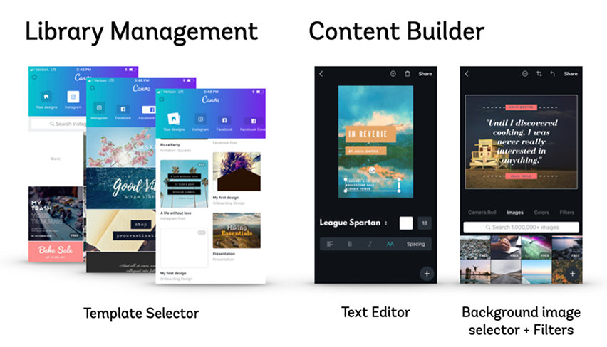
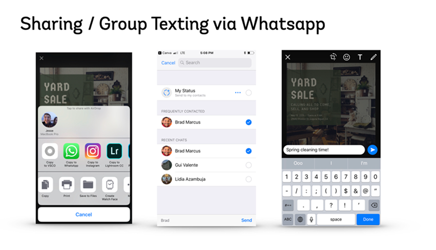
Canva
Canva — Templates & editor. Template selector, text editor, background picker and filters. The most complete canvas of the six, and the reference for how much editing power could live on one surface without a settings screen.
Canva
Canva — Sharing. Handing a finished design off to WhatsApp for group texting. Sharing is a destination picker, not a separate publishing step.
Snapchat
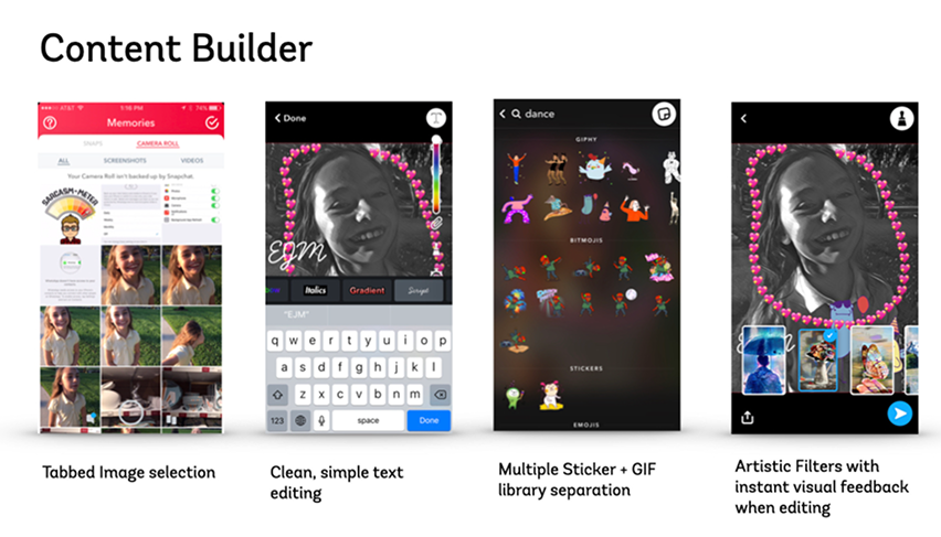
Snapchat — Content builder. Tabbed image selection, clean text editing, sticker and GIF libraries, artistic filters. Proof that a dense toolset can stay out of the way when every tool is one tap from the canvas.
Instagram
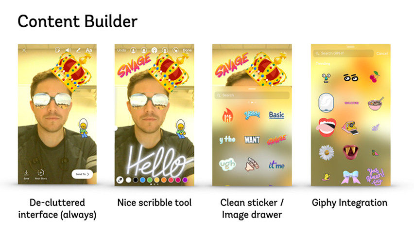
Instagram — Stories editor. De-cluttered interface, scribble tool, sticker drawer, Giphy integration. The least chrome of any editor here — the canvas is the screen and the tools sit on top of it.
Instagram
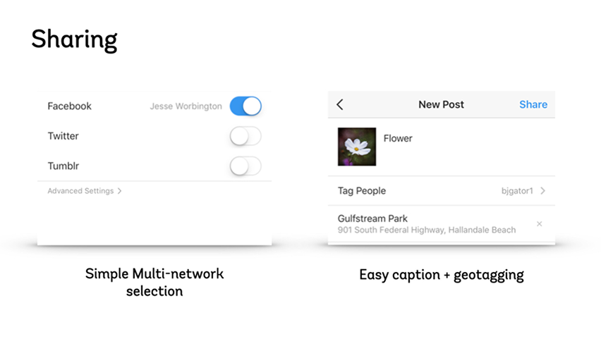
Instagram — Sharing. Multi-network selection, caption and geotagging in a single pass. The closest model for the share step ClassBuzz needed.
Buffer
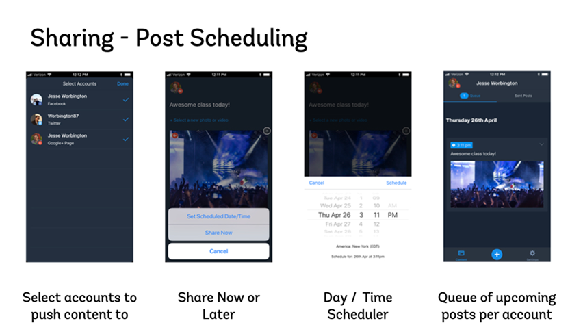
Buffer — Post scheduling. Account selection, share now or later, a day and time picker, and an upcoming queue. The only product benchmarked that treats posting as something managed over a week rather than finished in a moment.

Screenshots are the property of their respective owners, reproduced here for comparative analysis.

Research — Personas

The same app had to work for three types of instructor

With the research in hand, I synthesized instructor behaviors into three personas that shaped every design and prioritization decision that followed.

The personas are composites, and the line under each name is written to capture that attitude — not something one person said.

Lost Lucy
Lost Lucy

"I know that social media is where the people are. How do I get to them effectively?"

Defining Traits
  • Understands the value of social media but doesn't know how to use it well
  • Not very tech savvy
  • Relies on flyers and word of mouth
  • Has loyal students but is unsure how to expand
  • Fearful of complicated apps
Social Sharon
Social Sharon

"I've taken a lot of steps to promote myself with some success. I know I could be doing better though."

Defining Traits
  • Spends a lot of time on social media
  • Savvy and critical with high expectations
  • Already has her own methods
  • Brand ambassador
  • Actively teaching and communicating with students
Gym Jim
Gym Jim

"My gym handles everything for me. Why do I need another app? Also, why is everyone so excited about Instagram?"

Defining Traits
  • Doesn't see the need for social media
  • Gym handles all promotion
  • Acquiring new students isn't a priority
  • Teaches other programs outside Zumba
  • Superficial understanding of social media
Research

Two days to decide what not to build

I co-ran a shortened Google-style Design Sprint with the other designer on my team, to jump-start the project, align on goals and shape an initial feature set grounded in user needs.
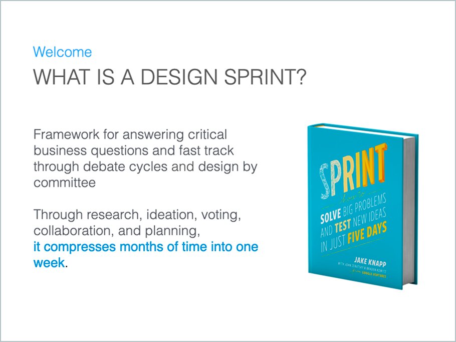
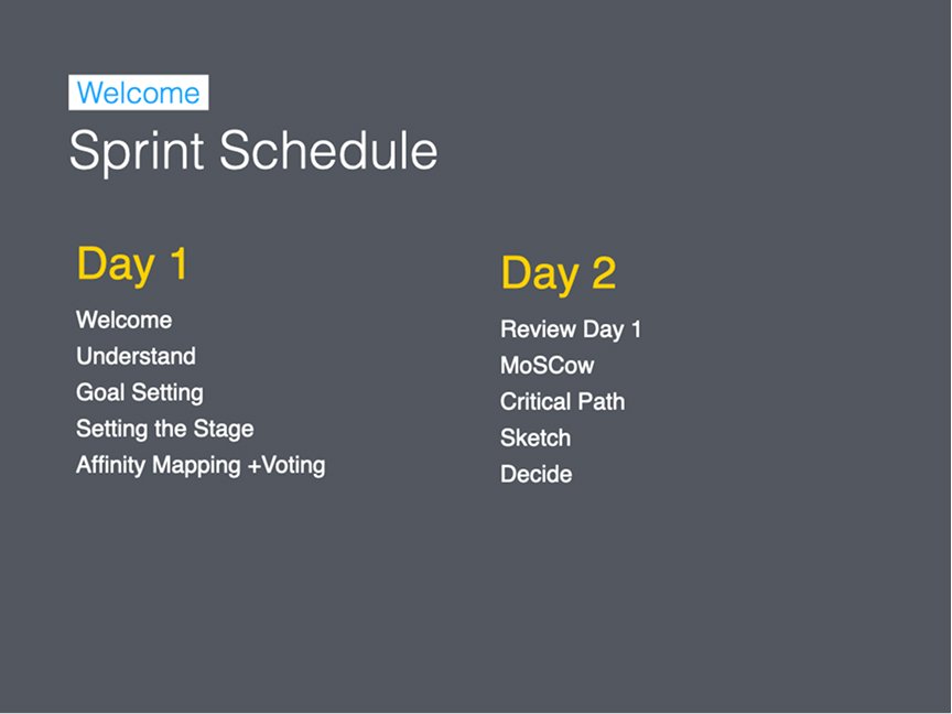
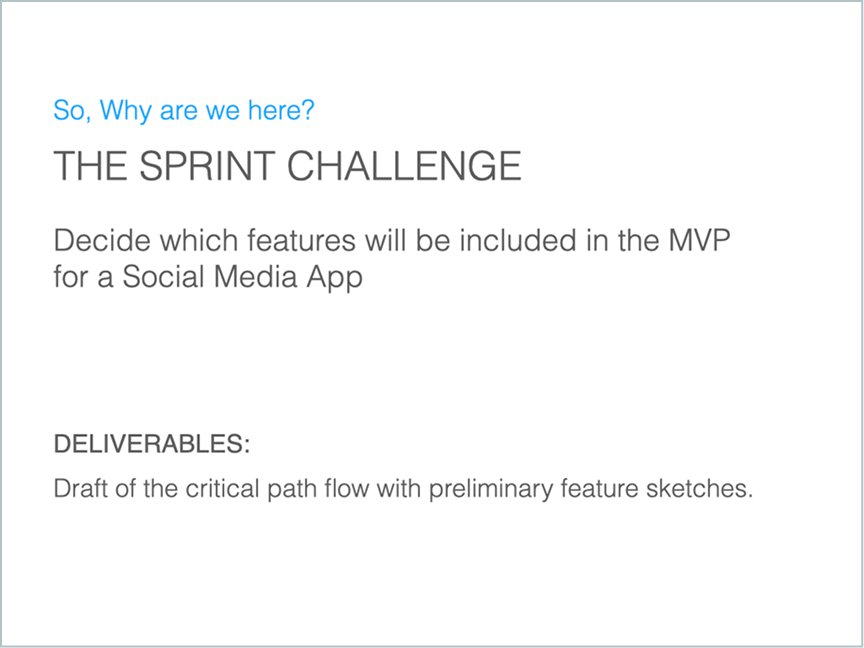
Sprint kickoff 1. Opening slide: what a design sprint is, and the promise that sold it internally — compressing months of debate cycles into one week. Sprint kickoff 2. The two-day schedule. Day one to understand and diverge — goal setting, affinity mapping, voting. Day two to converge — MoSCoW, critical path, sketch, decide. Sprint kickoff 3. The challenge as it was framed to the room: decide which features make the MVP. Deliverables were a draft critical path and preliminary sketches, not a finished design.
Sprint Day 1

The first day focused on understanding the problem space, goal setting, defining success metrics, and affinity mapping.

Defined Goals

Short term

Easy way to create and share custom branded marketing materials on social media to promote your classes and yourself.

Long term

(Short term goals plus) An easy way for instructors to get insights, communicate with students and manage their classes / students.
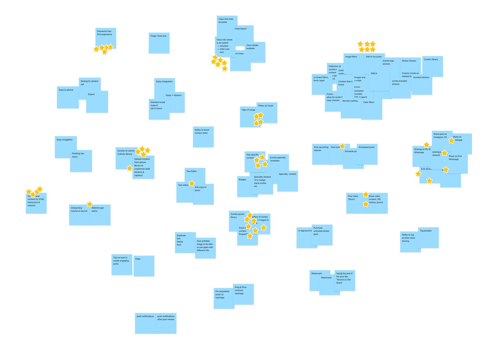
Affinity Map

Affinity map. Day one output. Everything the team knew, grouped into clusters, then dot-voted — the yellow dots are where the room actually agreed.
Sprint Day 2

On Day 2, we ran several narrowing exercises: MoSCoW prioritization, critical path user flow, and Crazy 8s sketching.

MoSCoW Exercise

Must
  • Share on multi-platforms
  • Custom stickers / add-ons
  • License / specialty customizations
  • Text editor (simple)
  • Upload / take photos
  • Onboarding flow
Should
  • Video clips
  • Image library
Could
  • Schedule post
  • Filters
  • Class info from database
Won’t
  • Music add-ons
  • Password-free experience
  • SYNC integration

Critical Path User Flow

The first of our final deliverables from the design sprint is a simplified end-to-end user flow. The next section maps a “Crazy 8” sketch to each step in it.
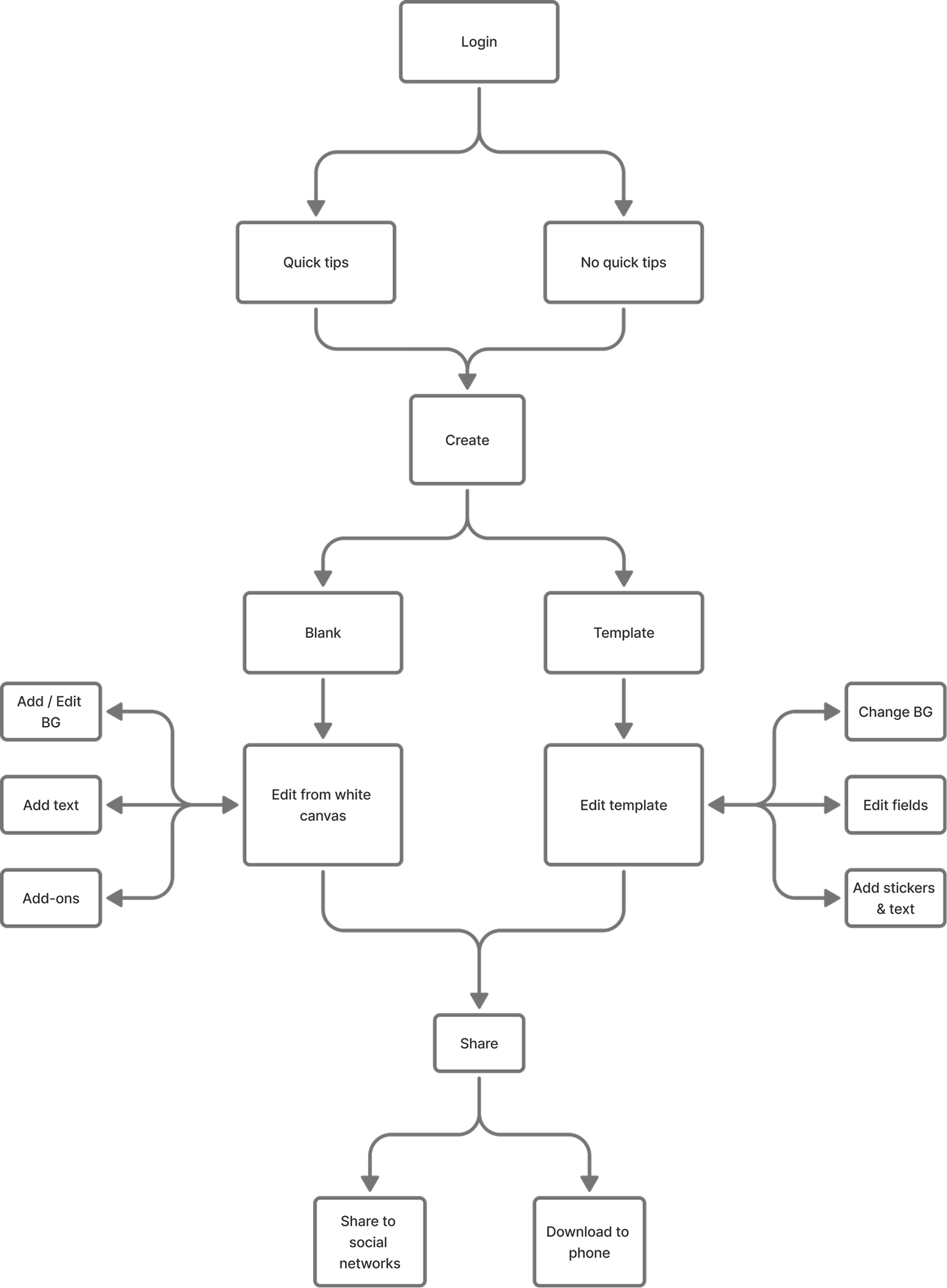
Critical path flow. The critical path that came out of day two: log in, choose blank or template, edit, share. Every branch on this diagram survived into the shipped app.

Crazy 8s — Highest Voted Sketches

Each participant took 8 minutes to sketch 8 screens based on one step in the user flow. These voted winners formed the foundation for our initial prototype.
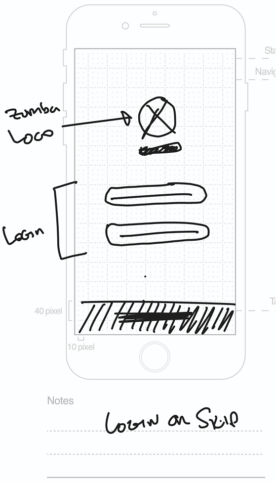
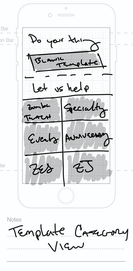
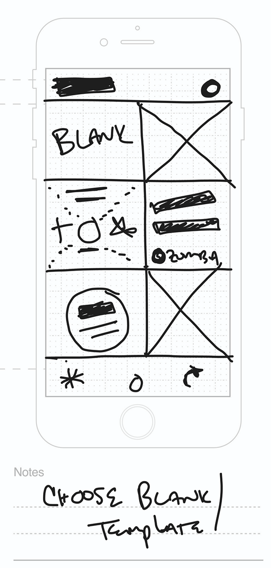
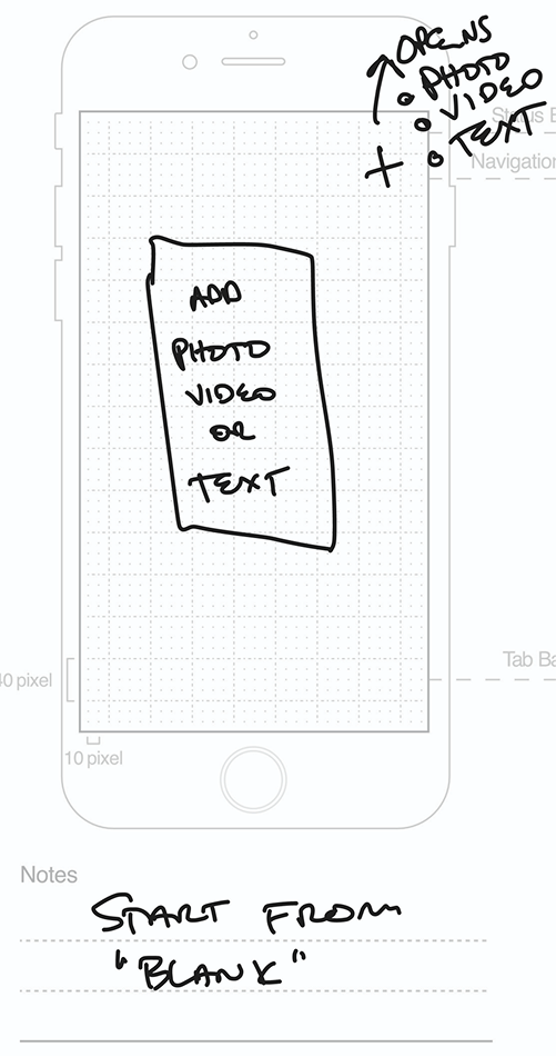
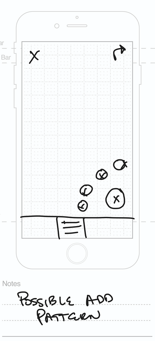
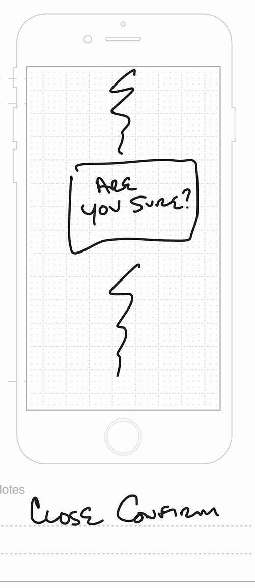
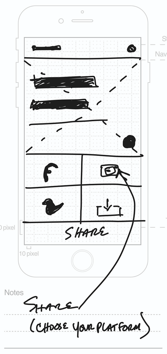
Crazy 8s 1. Login or skip. The first question the app has to answer is whether an instructor can look around before committing. Crazy 8s 2. Template category view — classes, specialty, events, anniversary. Sorting templates by the occasion an instructor is posting about, not by format. Crazy 8s 3. Choose blank or template. The fork that ended up defining the whole builder: start from scratch, or start from something. Crazy 8s 4. Starting from blank — add a photo, a video or text. The empty state needed to offer three ways in rather than one. Crazy 8s 5. An early pass at layer controls, and where the editing model started to get complicated. Crazy 8s 6. Close confirmation. Sketched this early because losing a half-built post is the one failure an instructor would never forgive. Crazy 8s 7. Share, with platform choice. The end of the critical path, and the reason the app exists.
Solution

One canvas, or a stack of steps

After aligning on the key insights from the sprint, I translated the validated ideas into workable solutions, refining the top concepts from each sprint exercise — evolving them into a happy path flow and rough wireframes that laid the foundation for our next round of design exploration.

User Flow

Using the sprint-generated flow as a foundation, I refined and extended it to capture the full range of ClassBuzz use cases, clarifying how each feature would support instructors from creation to publishing.
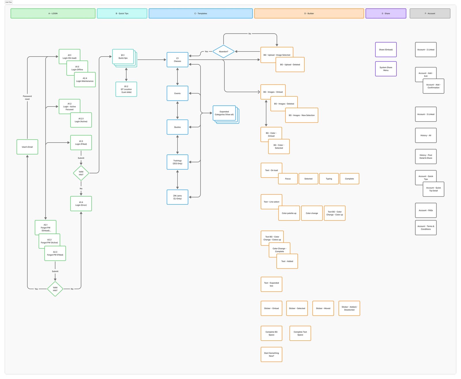
User flow. The full flow after the sprint, expanded into swim lanes — every screen, state and dead end the build would need to account for.

Wireframing

Three sets of wireframes were developed and tested with Zumba® instructors. Each round of feedback directly shaped the next iteration.

The pulled-out line after each wireframe round and design round below paraphrases what came up repeatedly in testing — not a quote from any one session.

Builder Wireframes v1

V1 had a very simplistic UI — three buttons below the canvas for text, stickers, and sharing. Background changes were triggered by tapping the canvas itself.
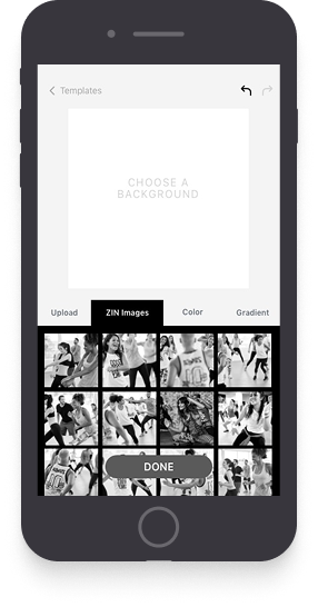
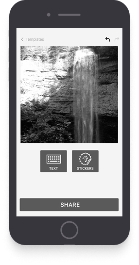
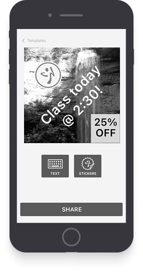
Wireframes v1 1. v1, background first: upload your own, or pick from the ZIN image library. The tabs assume the instructor knows what they want before they start. Wireframes v1 2. Background chosen, with text and stickers as the only two things left to do. Share sits at the bottom as a permanent commitment. Wireframes v1 3. Typing directly onto the post, with formatting under the field. Simple, but every edit meant going back through this same screen. Wireframes v1 4. The finished v1 post. It works, but the flow is linear — there is no way back to the background without starting over.

How do I change the background? — Wait, I have to tap it? Yeah, I never would've guessed that!

Builder Wireframes v2

I auto-opened the background selector and placed background, text and stickers as tabs on the right rail — each tab acting as its own workspace.
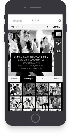
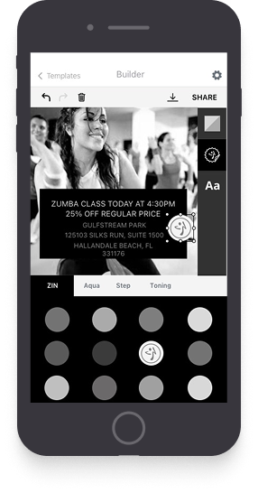
Wireframes v2 1. v2 introduces the Builder: one canvas with a persistent toolbar, so background, text and stickers stop being sequential steps. Wireframes v2 2. The sticker tray inside the builder, sorted into ZIN, Aqua, Shop and Training — the instructor’s categories rather than the asset library’s. Wireframes v2 3. Text and layer handling in the same canvas. Undo, redo and download move into the toolbar where they stay reachable throughout.

Are these colors or stickers? How do I customize the post with different color text?

Builder Wireframes v3

Version 3 brought enhanced text controls — adding color options for text and text backgrounds, plus simpler sticker controls for a better overall preview experience.
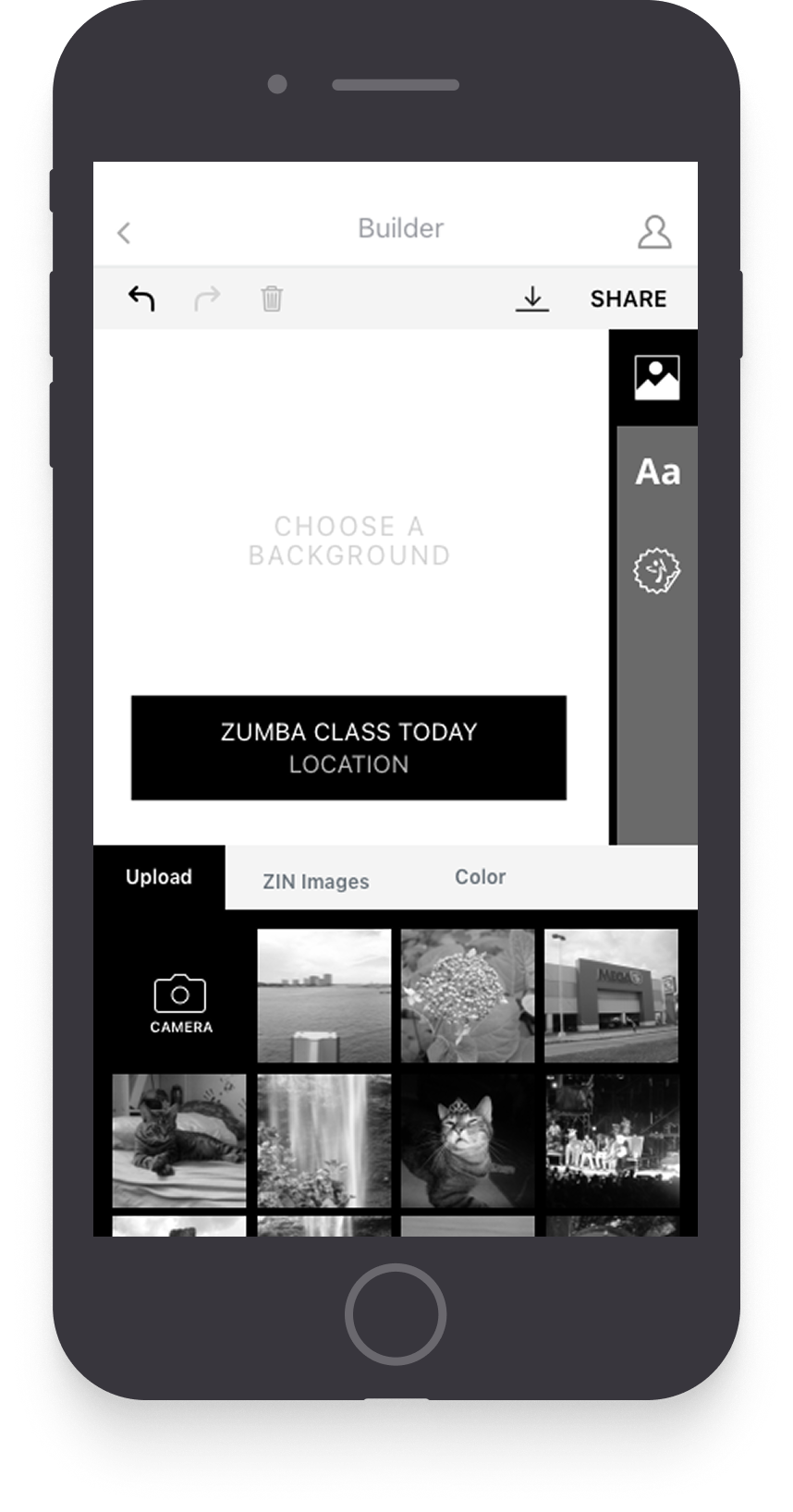
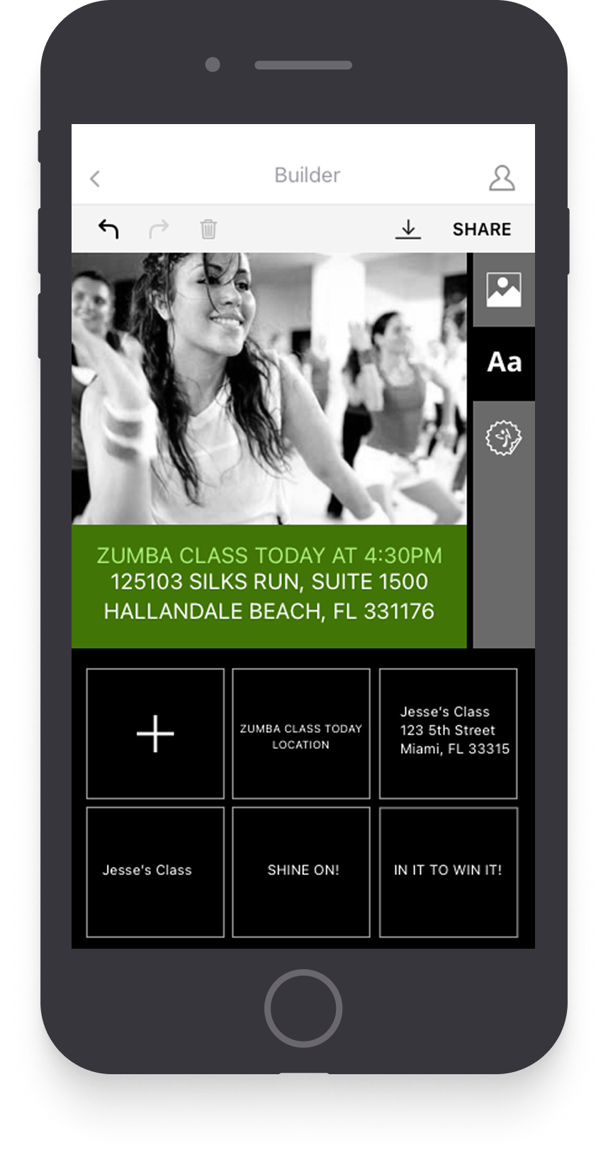
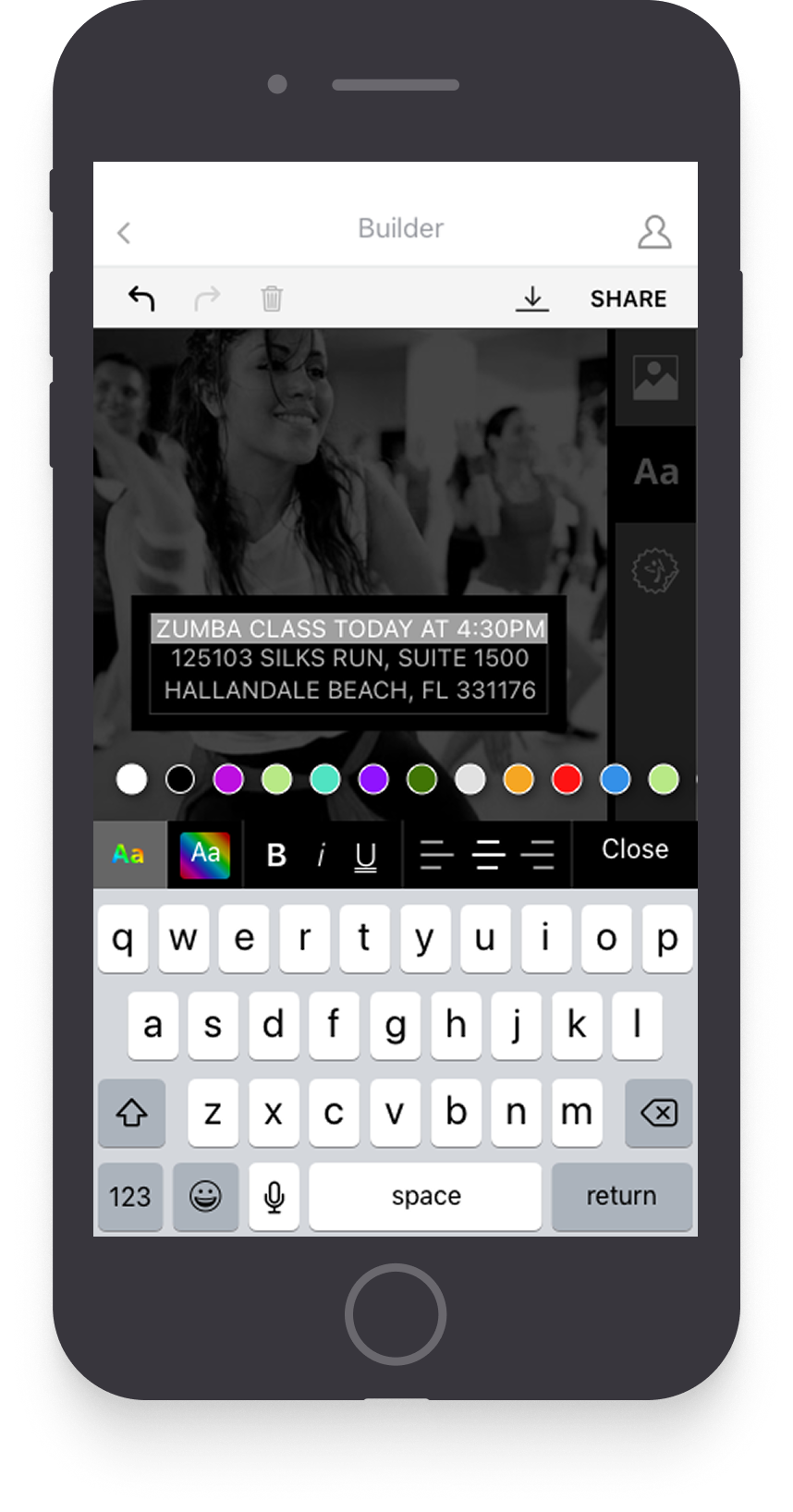
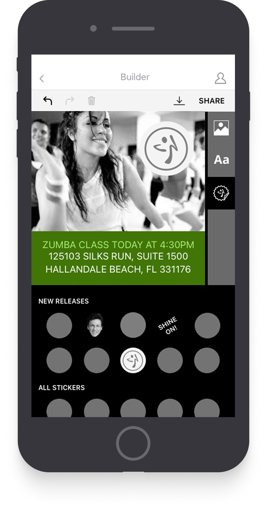
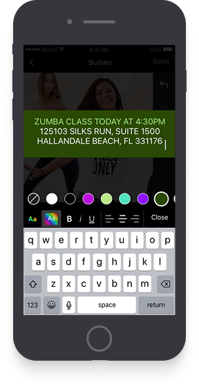
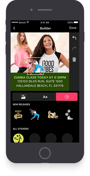
Wireframes v3 1. v3 puts the background picker back at the start, but as a step inside the builder rather than a gate in front of it. Wireframes v3 2. Template chooser. Testing on v2 showed instructors wanted a starting point more often than a blank canvas. Wireframes v3 3. Text styling with a colour row directly under the block being edited, so the effect of a choice is visible without dismissing the keyboard. Wireframes v3 4. Stickers split into New releases and All stickers — new content is the reason an instructor comes back, so it earns the top slot.

My eye doesn't go directly to the spaces on the right bar. Placing that toggle with my text and stickers makes more sense to me.

Visual Design

A dark palette for a brand that is anything but

Acting on the last round of wireframe feedback, I moved the controls below the canvas and undo/redo/delete to a narrow right bar — placing them in a more natural spot.
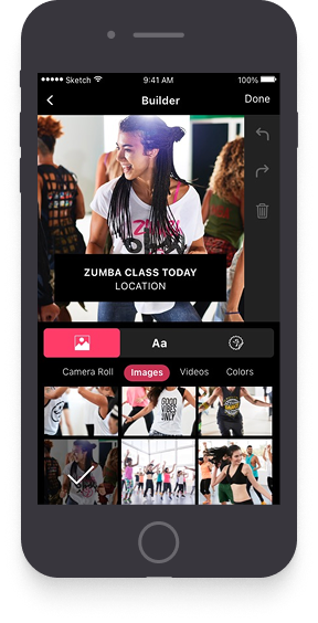
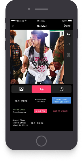
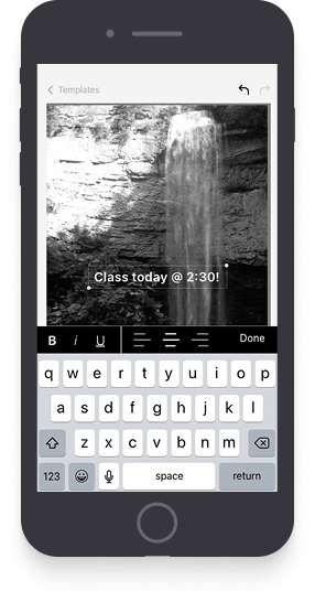
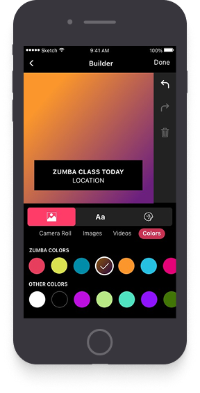
Design Round 1 — 1. Round one, dark UI. Camera roll, curated images, videos and colours as four peer sources for a background. Design Round 1 — 2. Preset text chips — New classes available, Zumba Cruise, Shine on. Written so an instructor with nothing to say still has something to post. Design Round 1 — 3. Colour backgrounds, with the Zumba palette given its own row above the general one. Brand colours are the ones most likely to be right. Design Round 1 — 4. The same layout carrying a different photo, checking that the text placement holds up against an image it wasn’t designed around. Design Round 1 — 5. Editing a text block in place, with the colour row and styling controls above the keyboard. Design Round 1 — 6. Stickers over a finished text block. This round is where the black chrome started to feel like it was fighting the artwork.

This is looking really good, guys, but why is it so dark? My classes are light and fun — so is Instagram and Facebook!

Visual Design

Light, and a 1-2-3 that tells you where to start

After testing Round 1, users were still unsure where to begin after selecting a post template. This led to the second and final version of the designs.

Here's what changed:

Dark to light: Moved from a dark palette to a light, energetic one that better matches Zumba's brand personality.

Larger workspace: Removed the right bar to better use horizontal screen real estate.

Quicker workflow: Top nav creates a stepped 1-2-3 flow. Separating background selection from post creation simplified the process and proved out in testing.
Onboarding

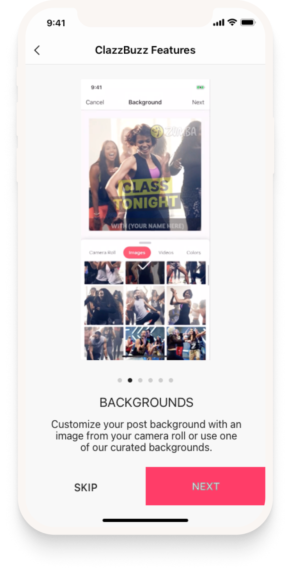
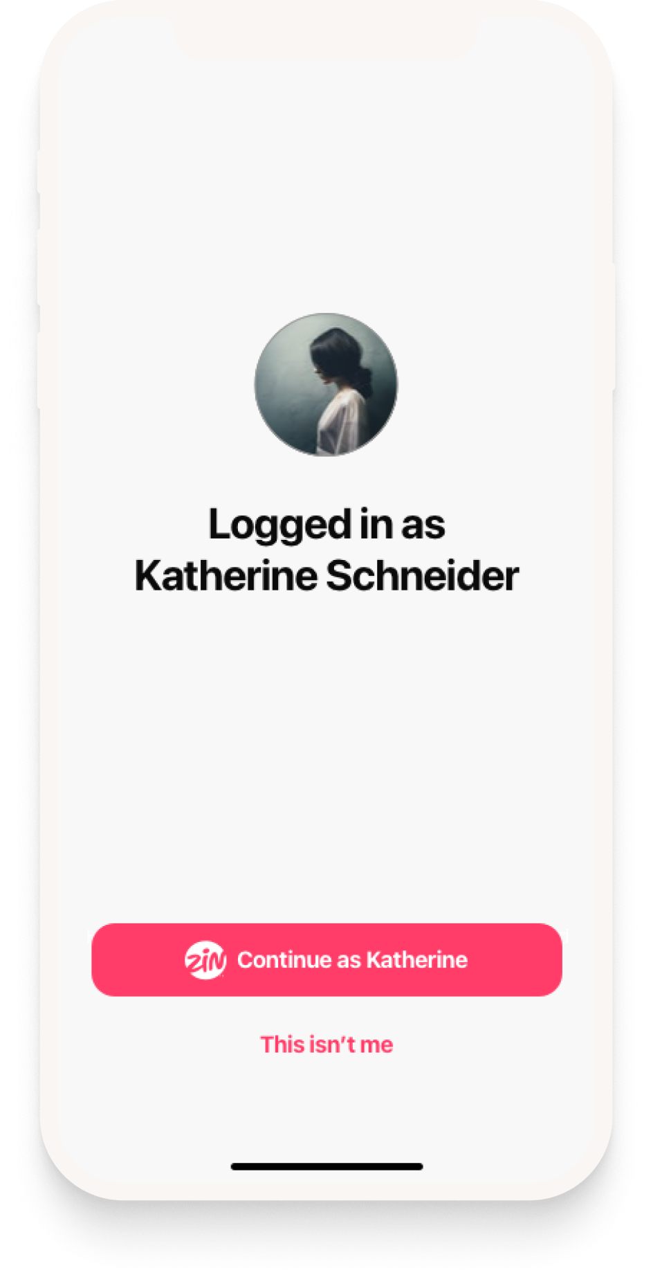
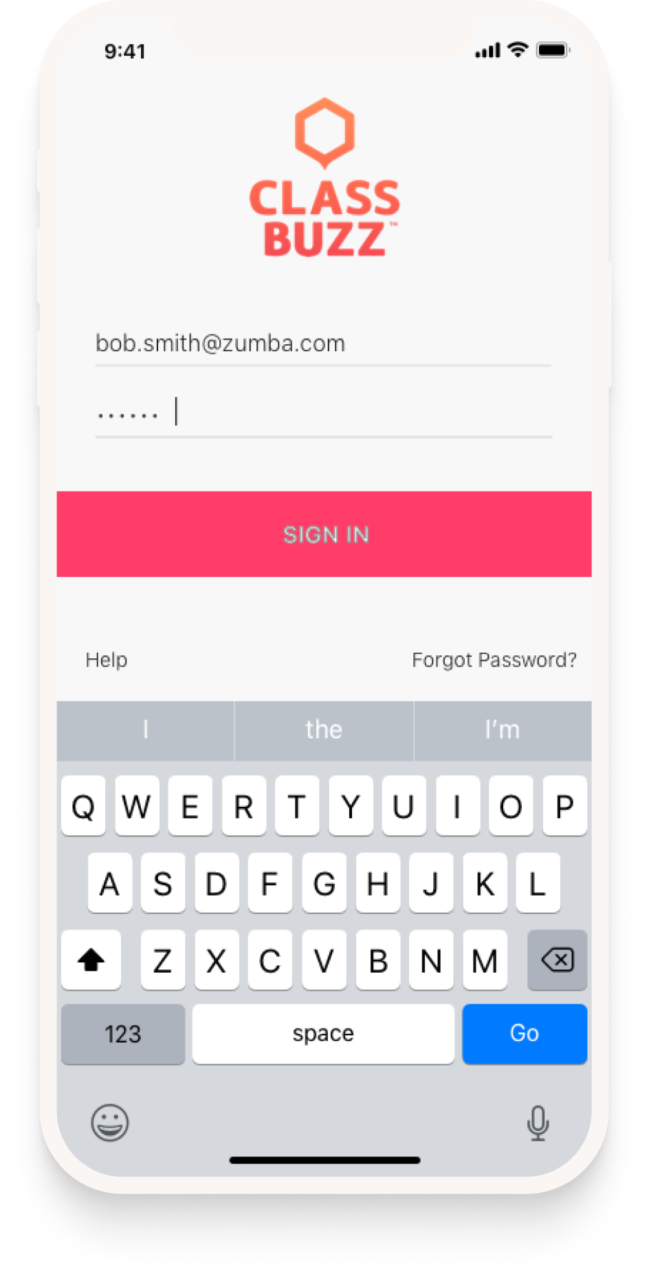
Onboarding 1. Returning instructors land already recognised, with one tap to continue and an obvious way out if the device isn’t theirs. Onboarding 2. Sign-in for everyone else — ZIN credentials, so there is no second account to create or remember. Onboarding 3. Card two of a six-card feature tour on first run, skippable from any screen. It walks through backgrounds, templates and stickers before an empty canvas can intimidate anyone.

Template Selector

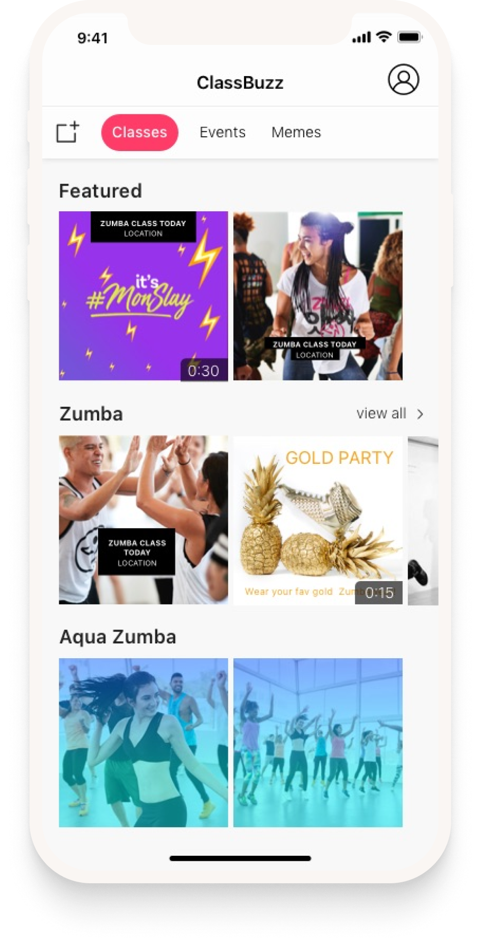
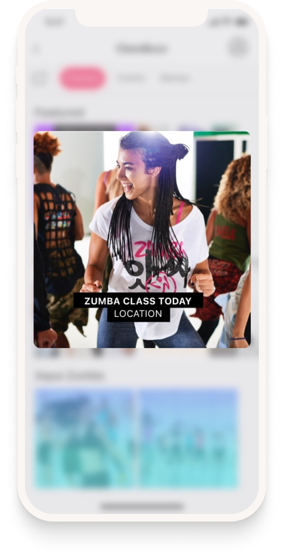
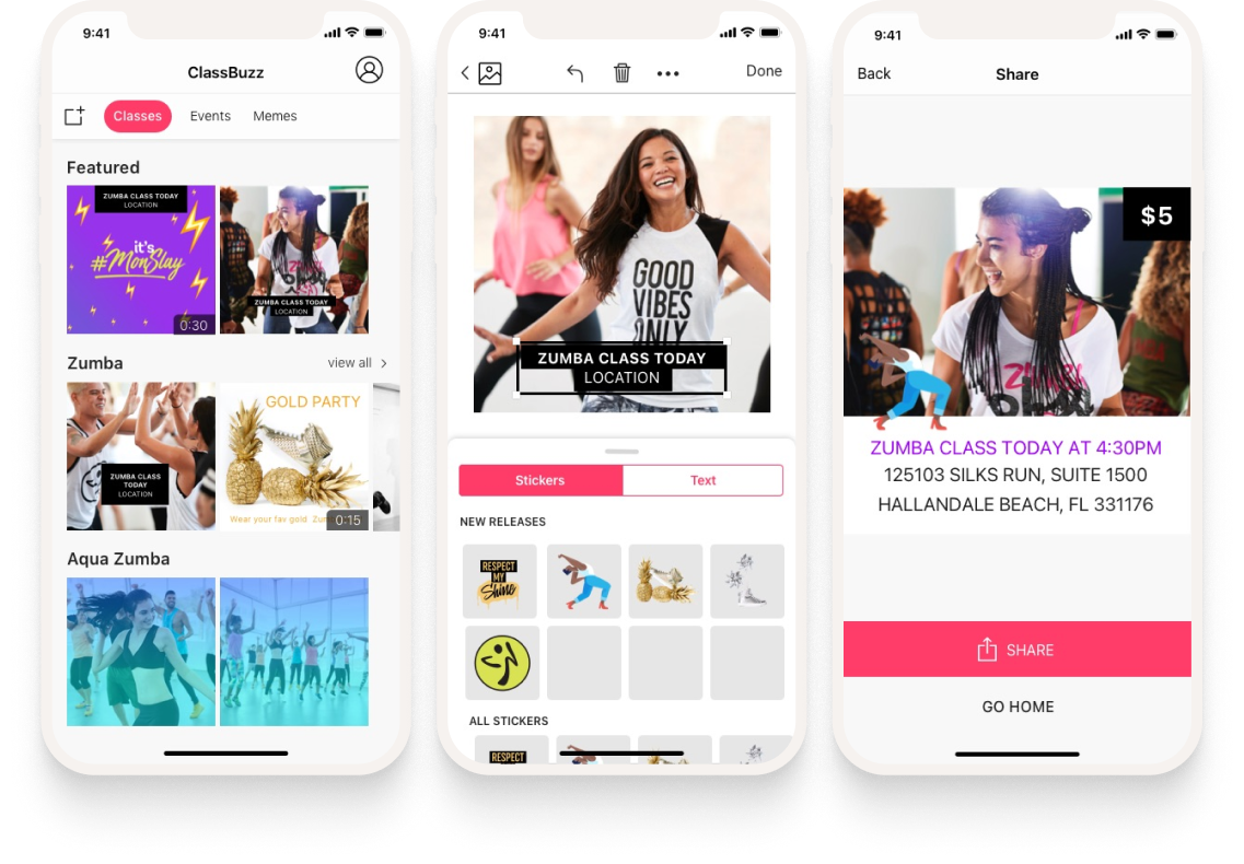
Template selector 1. The home screen: Classes, Events and Memes across the top, with featured content first and the instructor’s own programs below it. Template selector 2. The same screen mid-transition into the builder — the template stays on screen while it loads, so the instructor keeps their place.

Background Selector — Photo

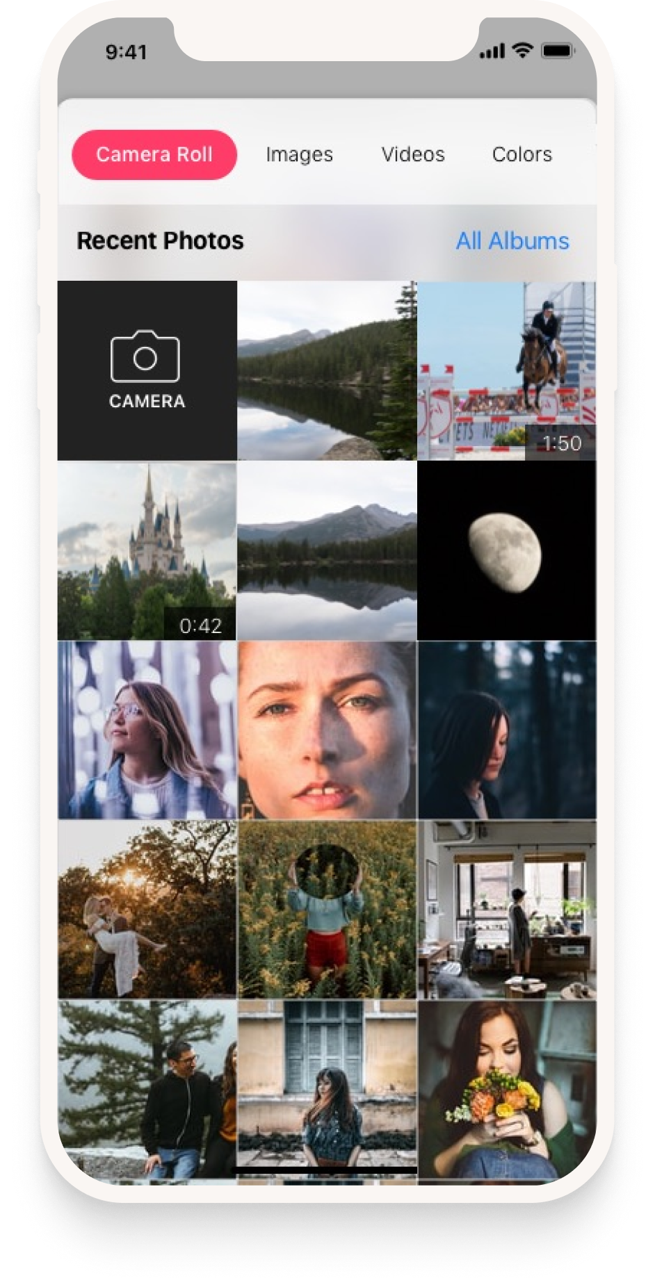
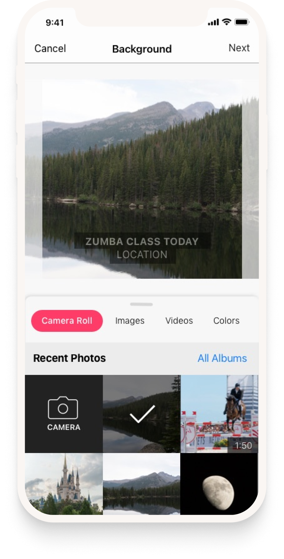
Background — photo 1. The photo picker opens on the camera roll, because the instructor’s own class photos are what they came to post. Background — photo 2. A selected photo with the class details already laid over it. The overlay appears before any editing, so the post is shareable from the first tap.

Background Selector — Video

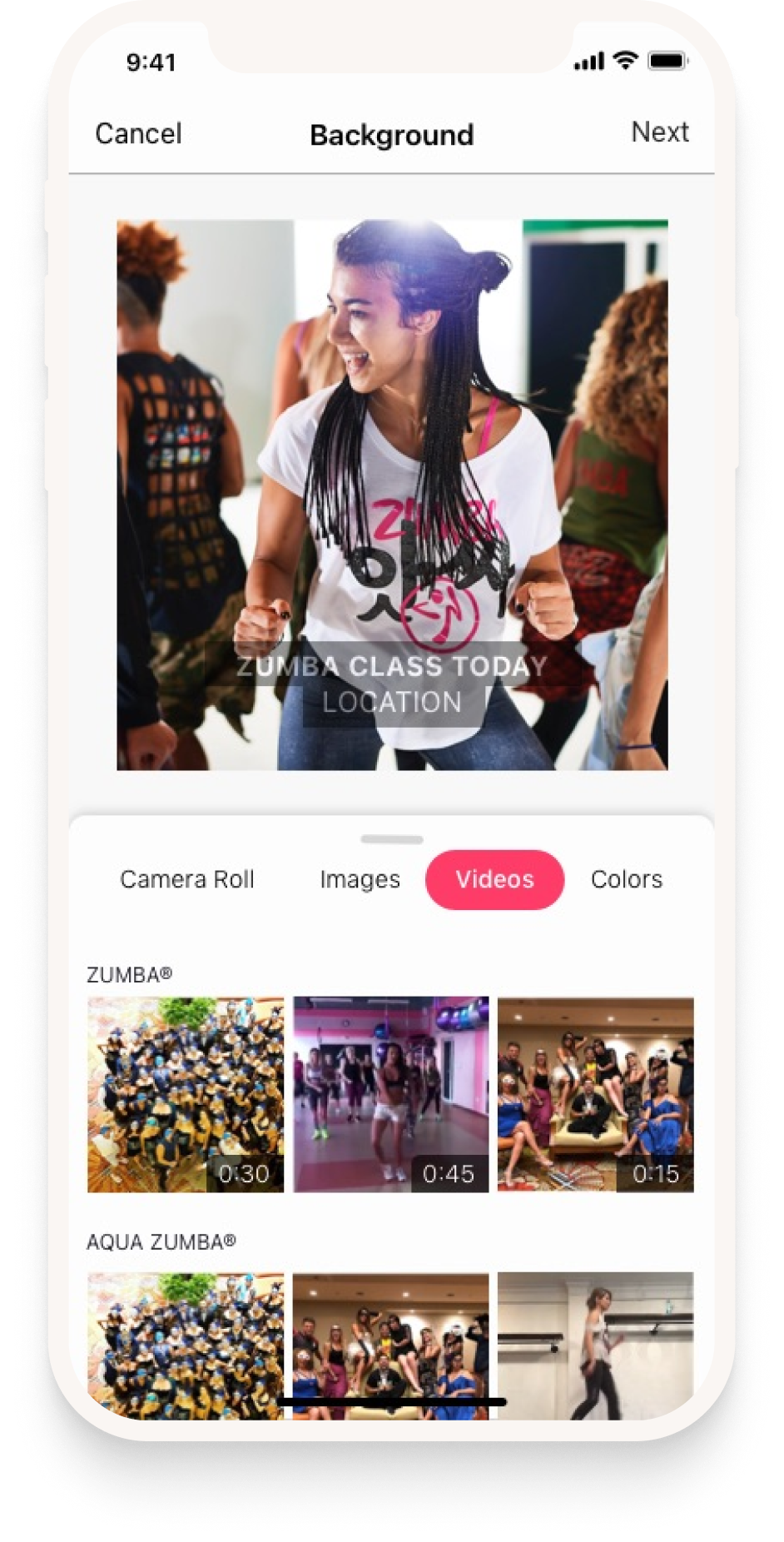
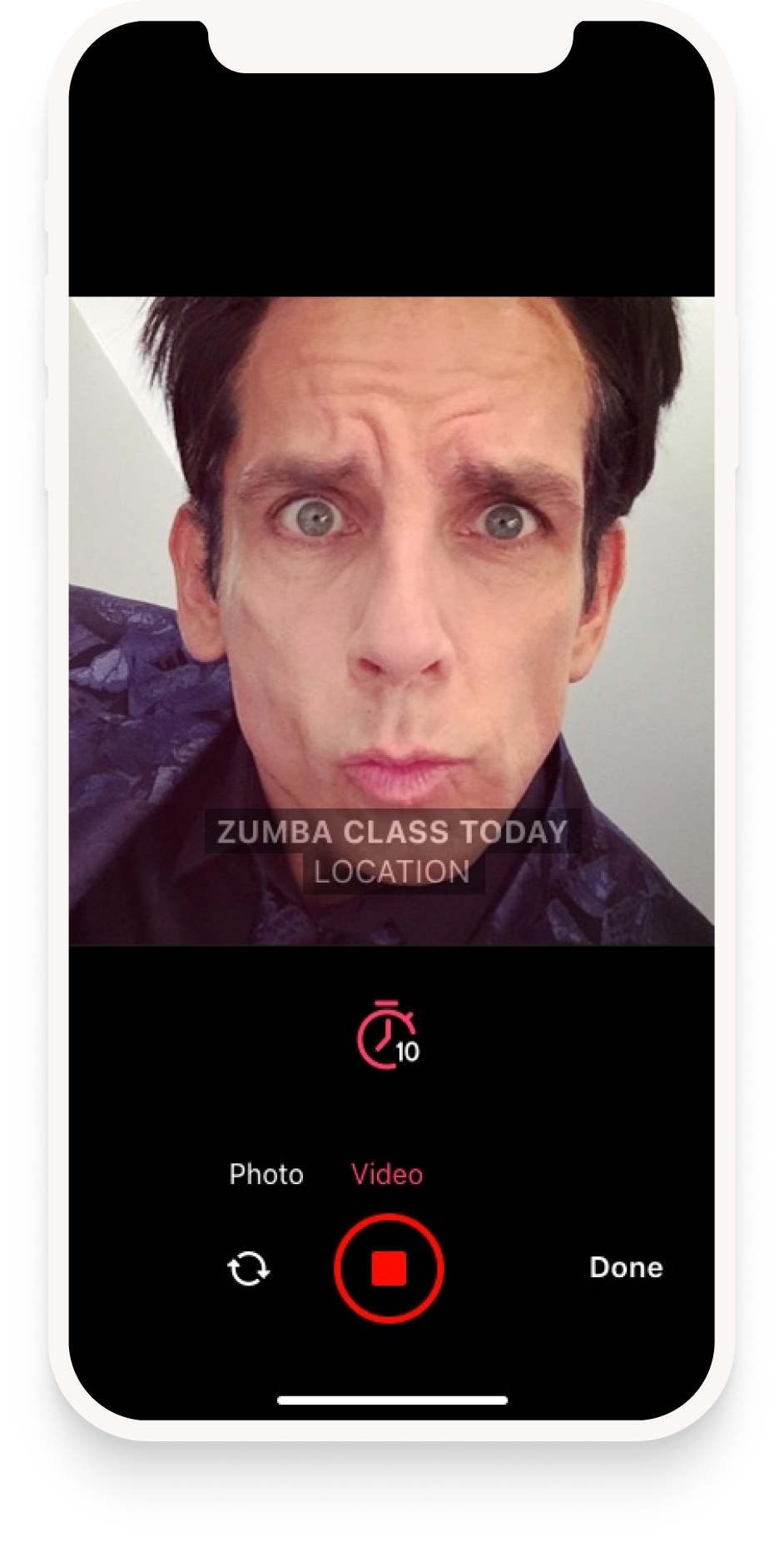
Background — video 1. Video as a first-class background, in the same picker and the same position as photos rather than behind a separate mode. Background — video 2. In-app capture with a ten-second limit. Short enough for every social platform’s constraints without asking the instructor to know them.

Text Editor & Stickers

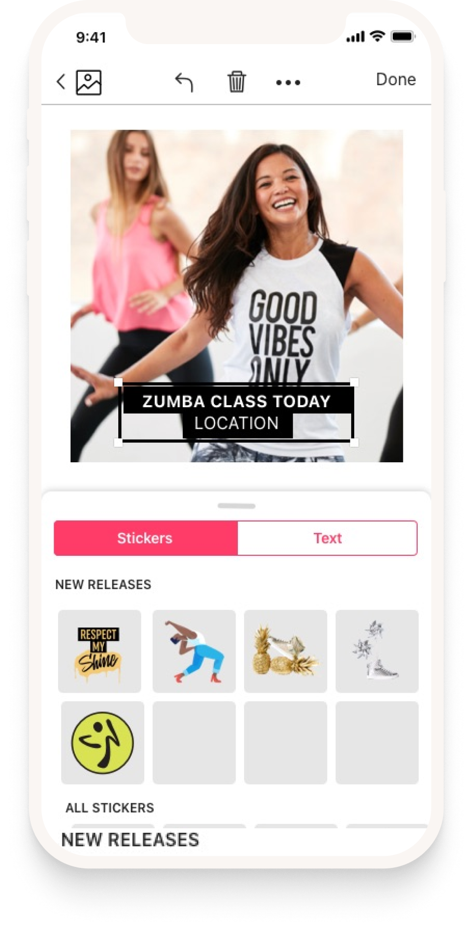
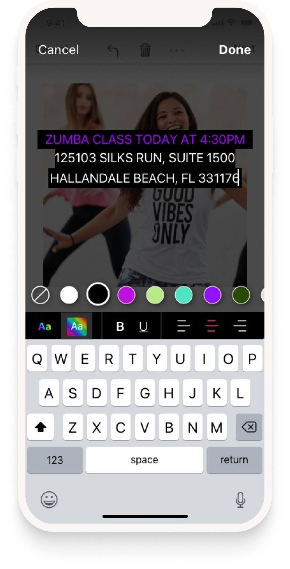
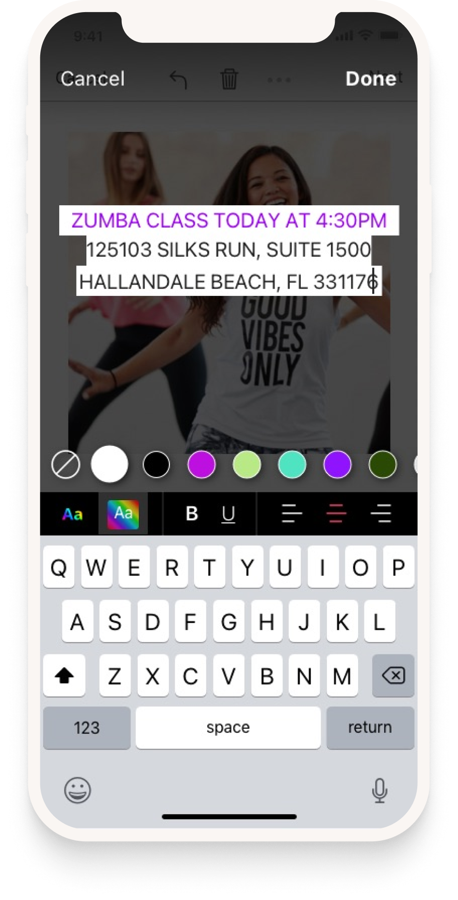
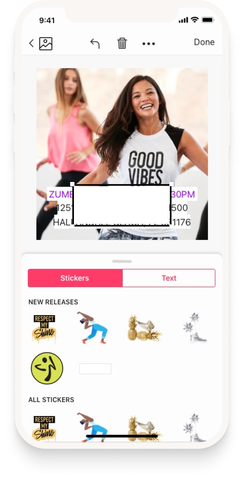
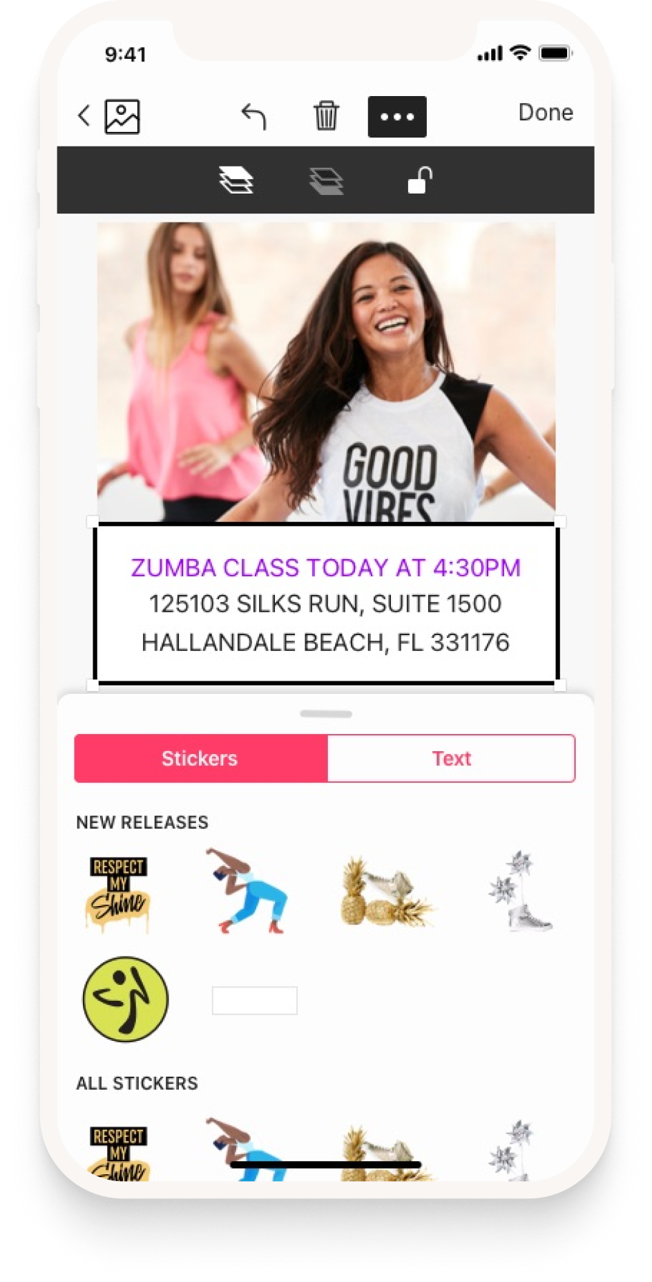
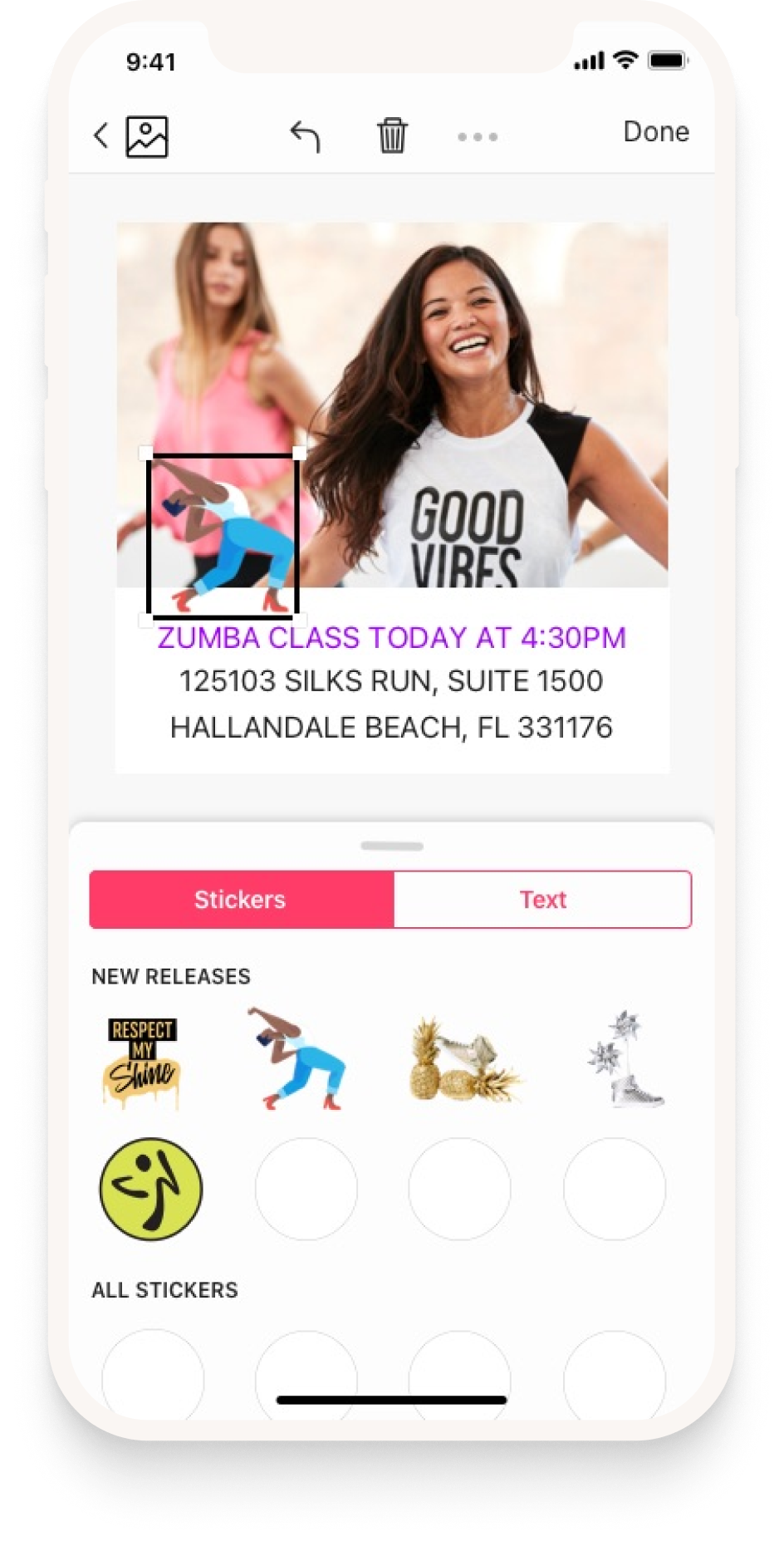
Text & stickers 1. The editor, with Stickers and Text as two tabs over one canvas and new releases surfaced first. Text & stickers 2. Text editing takes over the screen and dims the post, so the keyboard, the colour row and the styling controls all fit without crowding the artwork. Text & stickers 3. Colour applied live to the block being typed. Brand colours sit in the row, so an on-brand choice is the easiest one to make. Text & stickers 4. Back on the canvas, the finished text block sits as an object that can be moved rather than a field that has to be re-entered. Text & stickers 5. Selection handles for scale and rotation. Everything on the canvas is a layer, which is what made the builder worth rebuilding around. Text & stickers 6. A sticker placed and sized the same way as text — one interaction model for everything that can go on a post.

Sharing

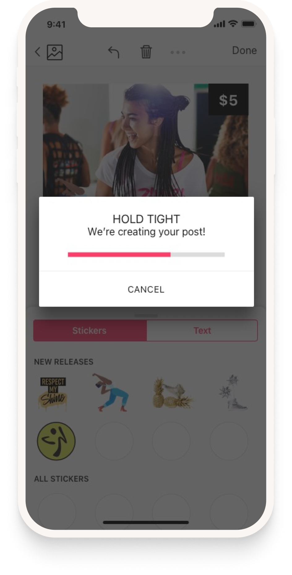
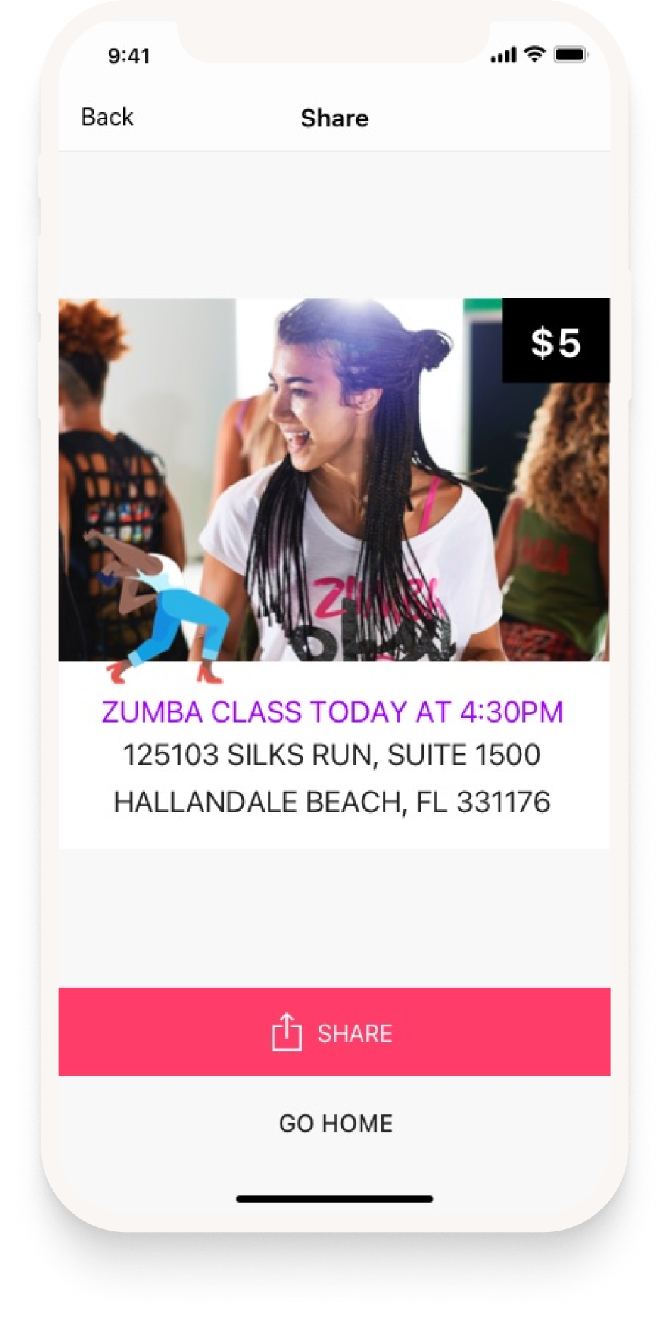
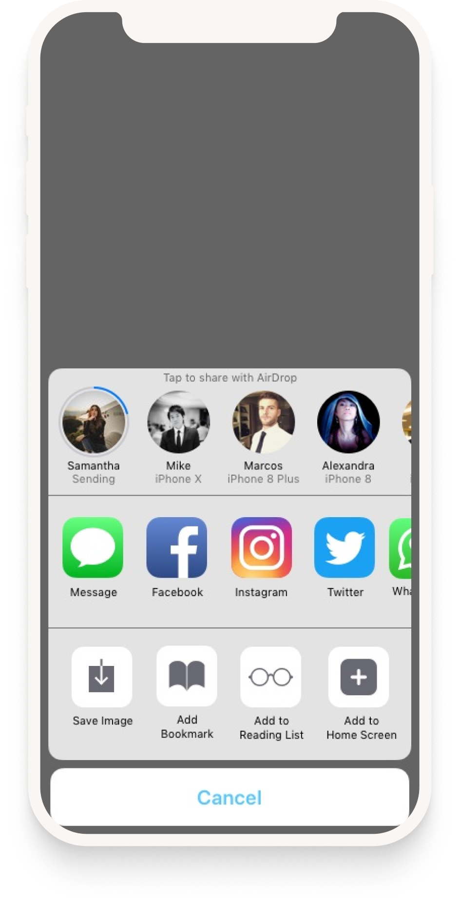
Sharing 1. Rendering, with a progress bar and a cancel. The post is composited before it leaves the app, so the wait happens here rather than in the share sheet. Sharing 2. The finished post, ready to go out, with a second chance to look at it before anything is published. Sharing 3. Handing off to the system share sheet — every platform the instructor already uses, plus save to camera roll, without the app maintaining its own integrations.

Account & Quick Tips

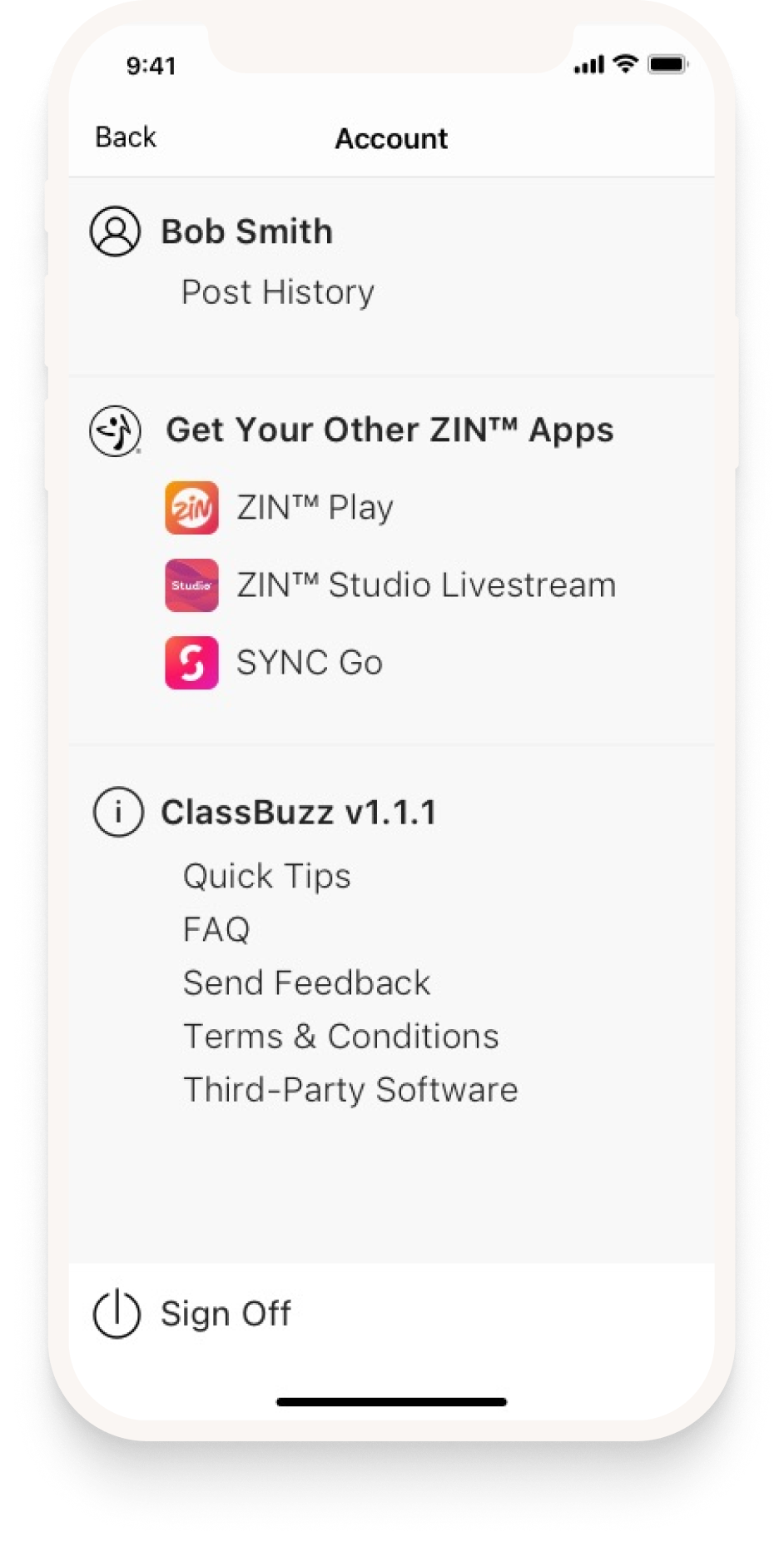
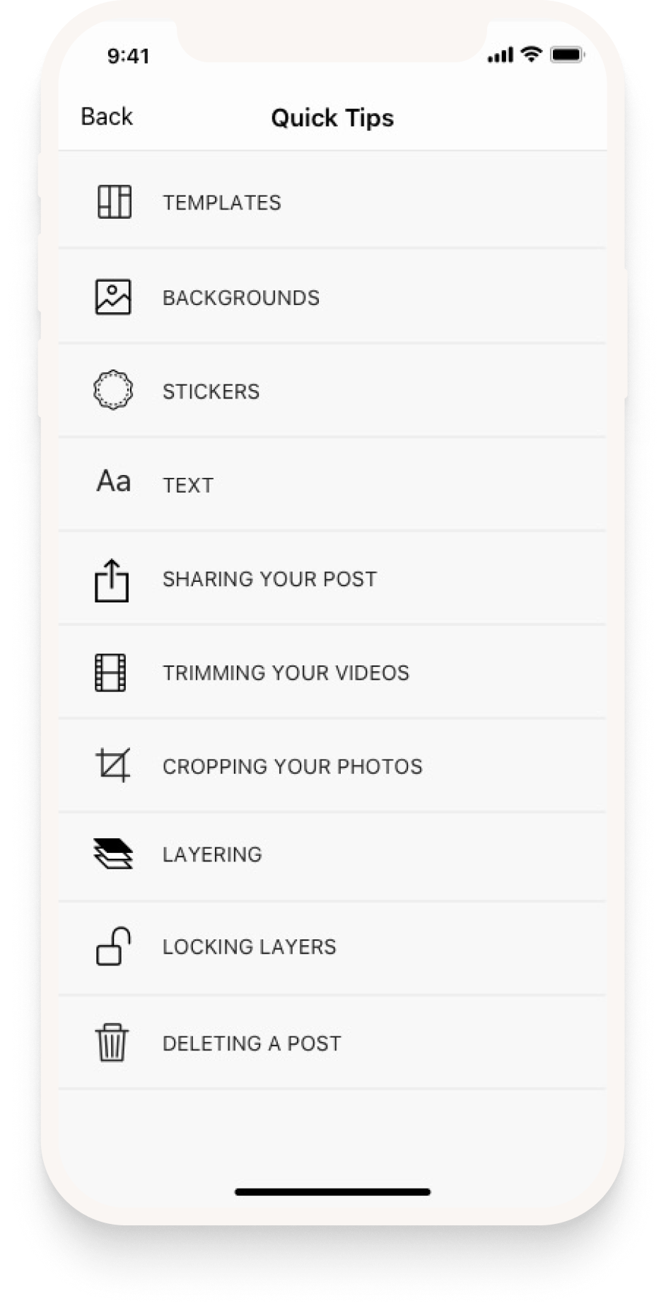
Account & quick tips 1. Account, post history, and the other ZIN apps an instructor already has. The app sits inside an ecosystem rather than pretending to be alone in it. Account & quick tips 2. Quick tips, reachable any time from the account screen: templates, backgrounds, stickers, text, sharing, trimming, cropping, layering.
Marketing

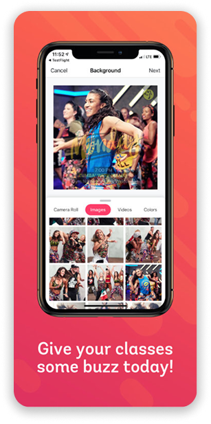
Selling it in six screens

Once the final brand direction came back from Zumba®’s marketing team, I used those patterns, colors and fonts to put together the following app store promo screens for Apple & Google Play stores.
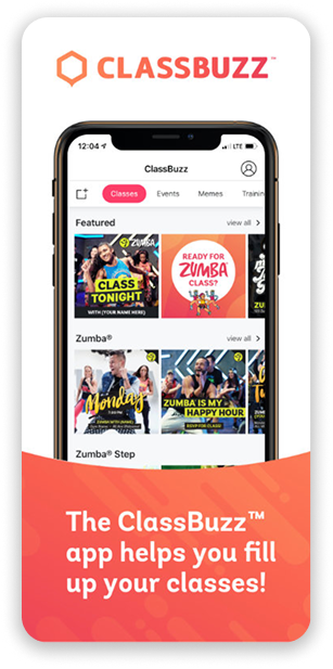
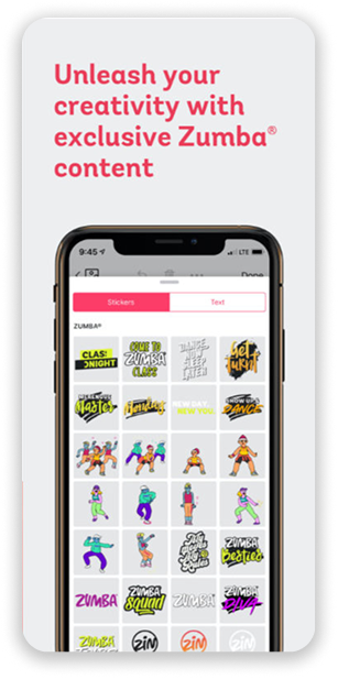
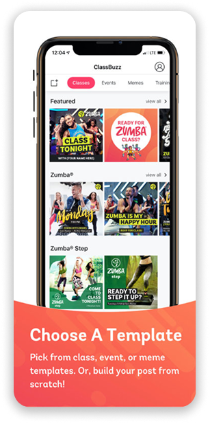
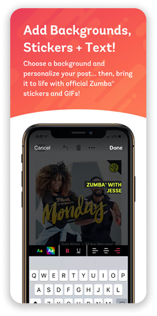
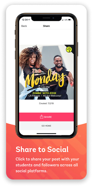
App store asset 1. Lead store screen. The headline is the instructor’s actual problem — filling classes — rather than a description of the software. App store asset 2. The sticker library as the hook. Exclusive branded content is the thing no other design app can offer them. App store asset 3. Templates: pick from class, event or meme, or start from scratch. Naming both paths up front so neither audience assumes the app isn’t for them. App store asset 4. Backgrounds, stickers and text in one frame — the builder’s three moves, shown as a single sentence. App store asset 5. Sharing to social, which is the end of the job the instructor is hiring the app to do. App store asset 6. Closing screen. Short, branded, and the only one of the six with no UI in it.
Results

Outcome & Impact

ClassBuzz shipped to the App Store and Google Play in 2019 and is still live seven years later, now on its second major version. I designed the original release; everything since has been built on top of it.

150K+
DownloadsGoogle Play
★ 4.4
Google Play551 ratings
★ 4.1
App Store63 ratings
7 yrs
In market2019 – present

Store figures as of September 2026. Apple does not publish install counts, so the download figure is Google Play only.

What we set out to move
  • More consistent promotional materials across the instructor network.
  • More engagement on class announcements, and more instructors posting at all.
  • Instructors confident they are using approved assets, without having to ask.
And for the business
  • Brand consistency across thousands of instructors posting independently.
  • Instructors able to promote themselves without a designer in the loop.
  • Fewer one-off asset requests reaching the brand team.

These were the goals the sprint set, and the store numbers are the only part of them I can evidence. Whether the network actually posts more, or more consistently, would need reporting I no longer have access to.

Takeaways

Reflection & Learnings

Balancing freedom vs. control: It's challenging but important to let instructors express themselves while enforcing brand consistency — well-designed constraints actually help both parties.

Mobile-first is essential: Many instructors rely entirely on their phones for business. Building mobile-first made adoption far more likely than a desktop-first approach would have.

Scalability demands smart UI: Offering templates and a curated asset library reduces support burden and ensures every instructor can produce good-looking content — regardless of design skill.

A frustrated instructor, plus ClassBuzz, equals a happy one.
More projects
2025 Banking Rewards Bank of America — Lifestyle Benefits View case study