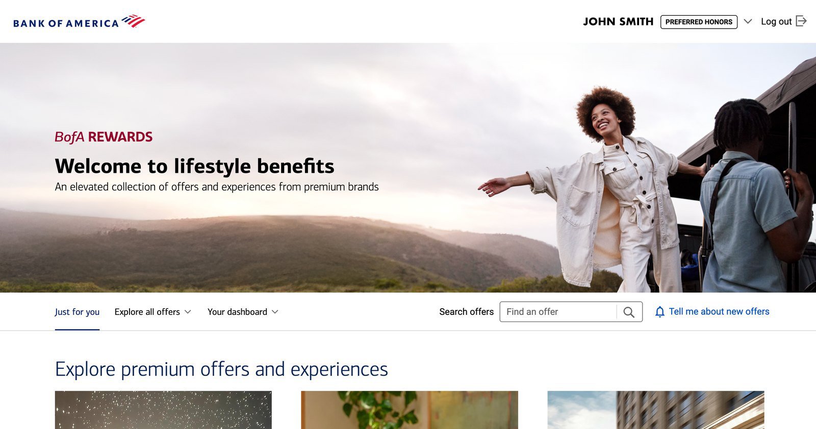
The page was written for clients who already knew the program. Now it had to work for clients who had never heard of it — and carry a lower tier of offers underneath the premium ones.
What lifestyle benefits are. Offers from premium partners — hotels, cars, wine, fashion, culture. Clients get them for banking with Bank of America, not by spending points.
The expansion. The program used to need $1M+ in combined balances. It opened up to $100k+ — the Preferred Honors tier — and a lower tier of offers was added for them, underneath the premium set already there.
The tiers. Preferred Honors clients see the lower tier. Premier clients see both, which is why they get the Premier toggle, to hide the less premium half.
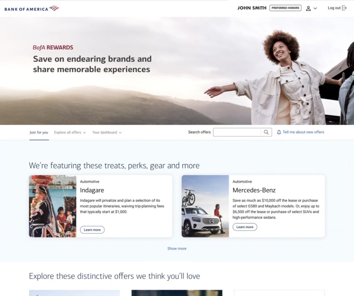
The new audience. Clients at $100k know premium hotels and restaurants. They just don’t expect them from their bank, so the page had to explain itself up front.
The brief asked for expansion and differentiation. We were rebuilding for both, so the offer grid and the navigation got improved along the way.
Premier and Preferred Honors want the same things. Premier’s offers are just bigger, and Premier clients see the lower tier too, so it was one page from the start. The explaining had to happen on the expansion side. A lot of the newly eligible clients weren’t familiar with these offers, and the page had to say what they were.
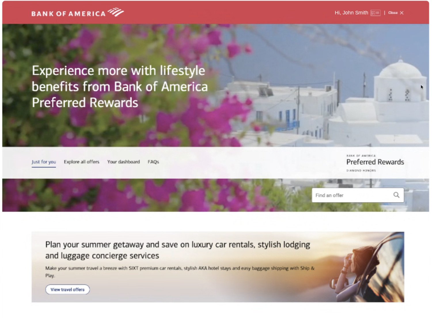
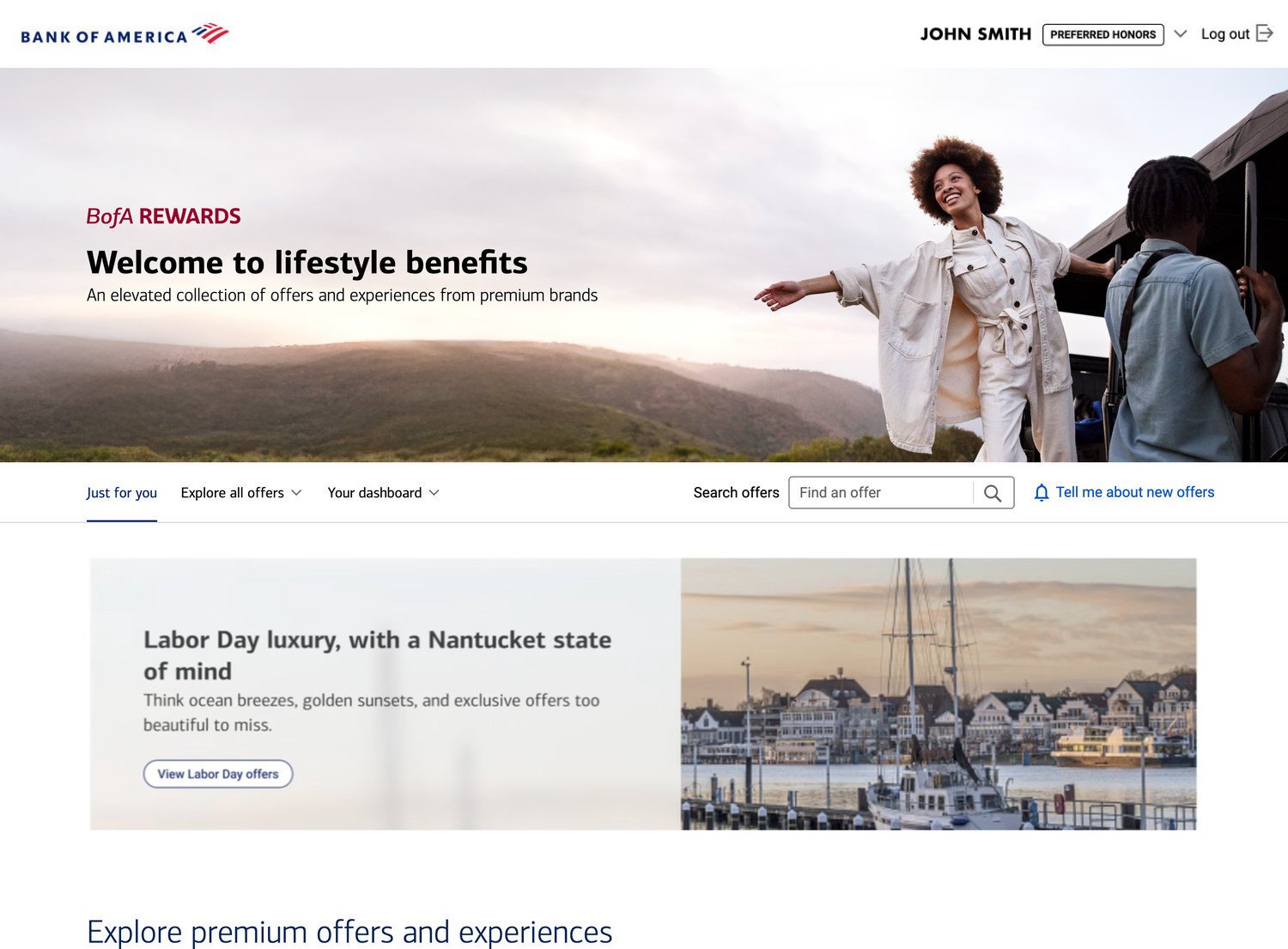
The FAQs moved because clients don’t have many questions before they’ve seen anything. Now the page runs header, then offers, then FAQs. The promo went from one fixed banner to a system, so the business gets options instead of squeezing every promotion into one shape.
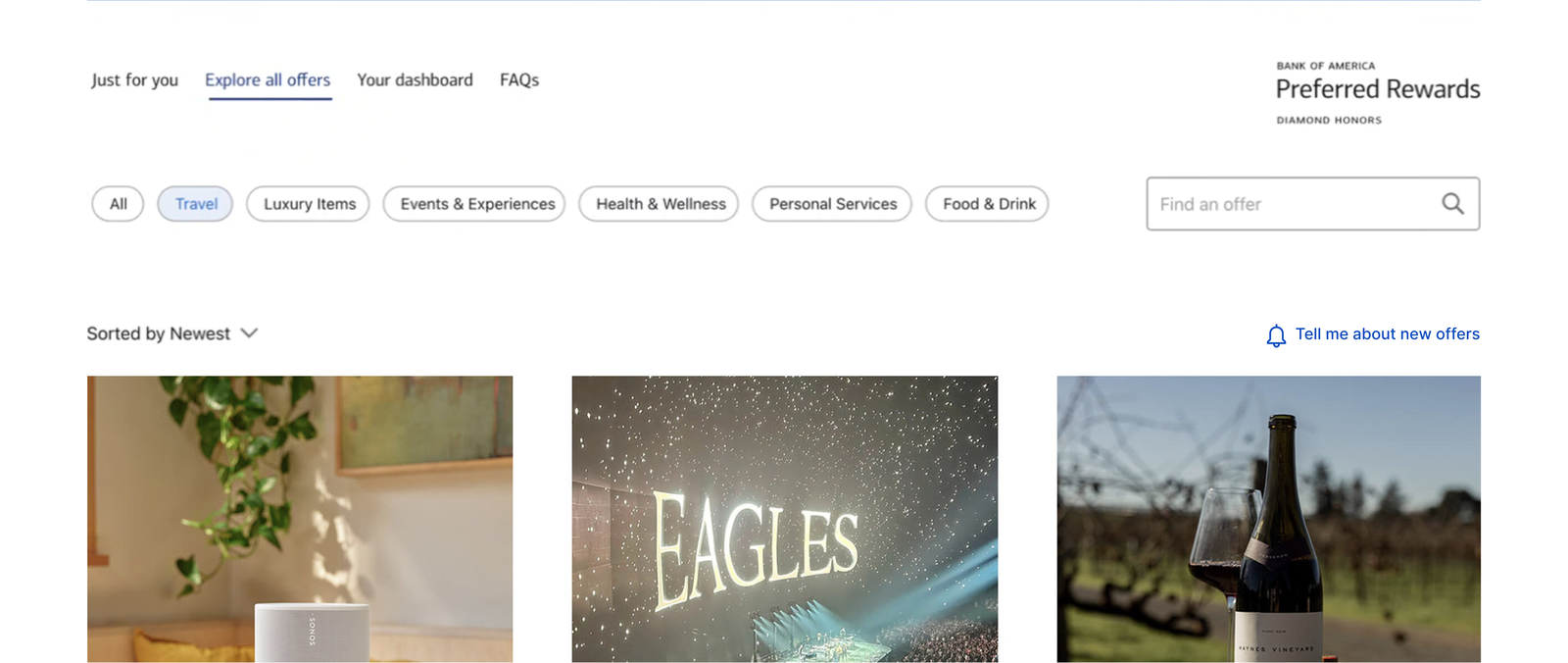
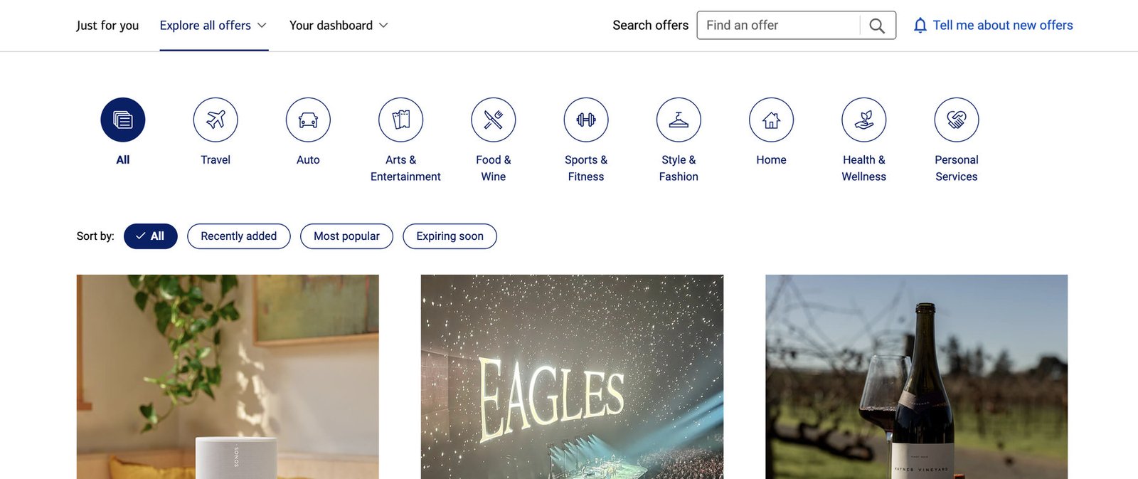
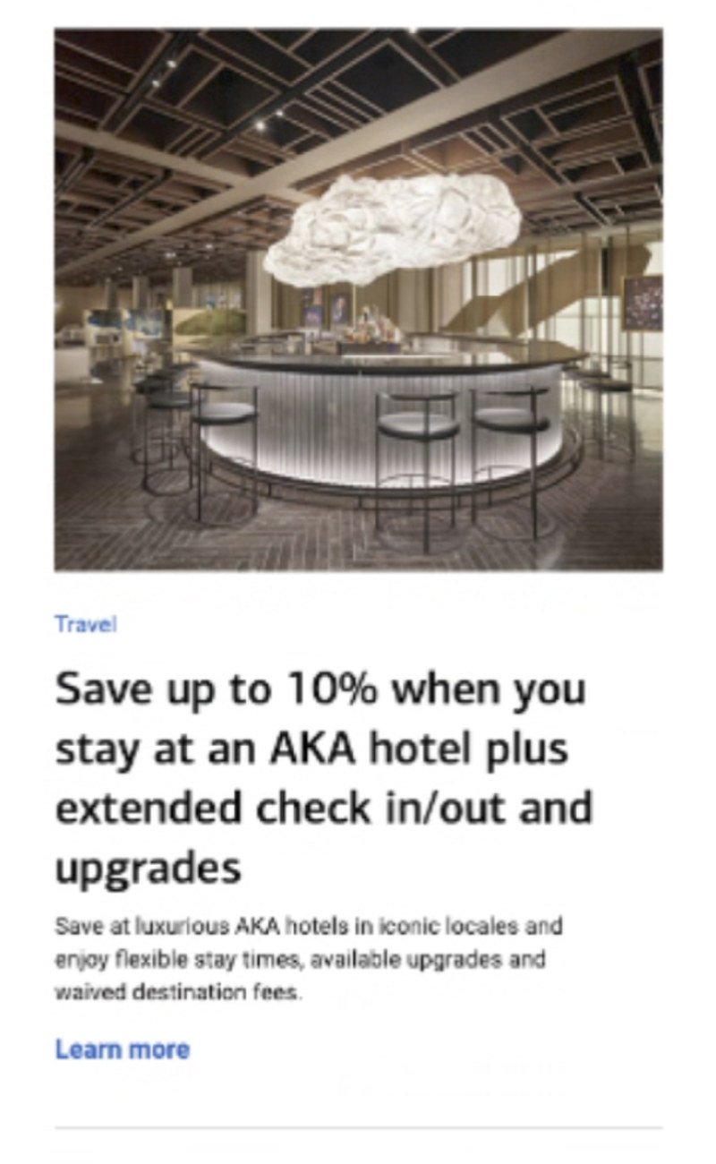
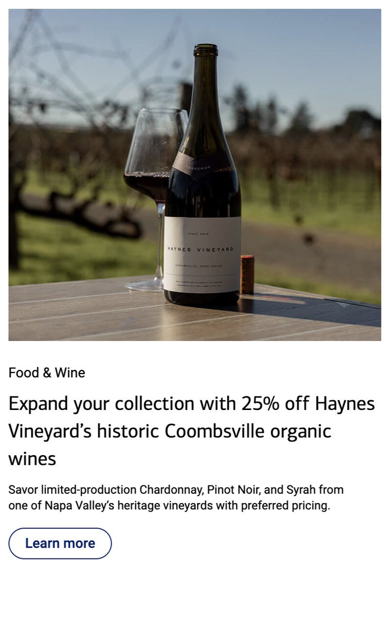
While we were in there, the grid got a pass for premium feel and usability. Four changes to the card, all of them bringing the page in line with Bank of America’s design system.
The hero uses different photography and different language for each tier. Preferred Honors leans on “endearing and memorable”; Premier leans on “iconic and bespoke”. Same idea, said a level up.
Premier clients see the Preferred Honors offers as well as their own. The Premier toggle is what separates the two, as shown below.
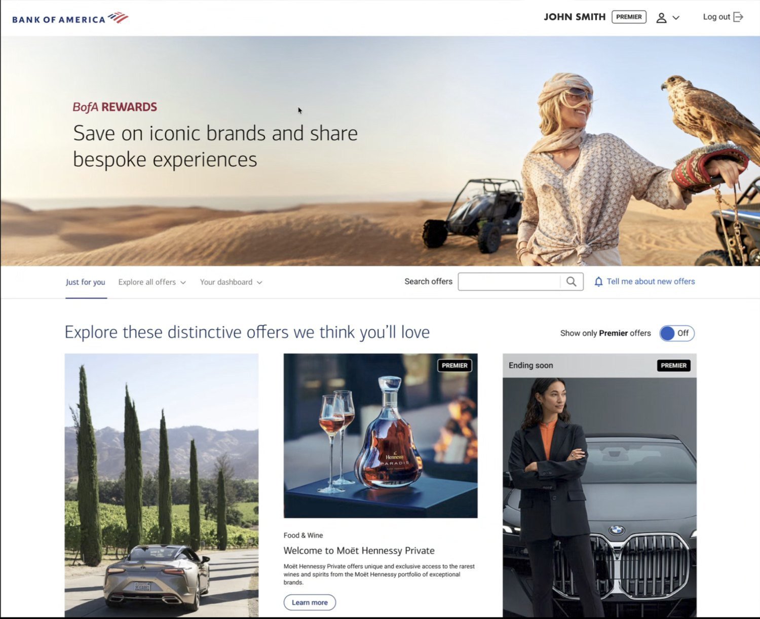
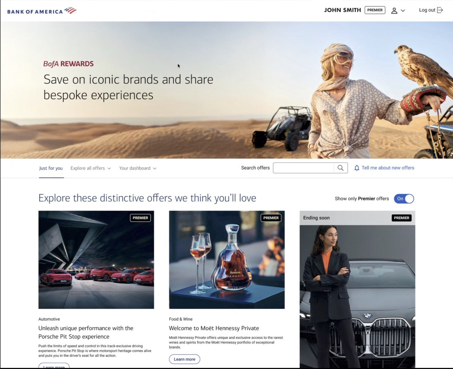
Off by default. Turning it on is the only thing on the page that leaves a client with fewer offers. A Premier client seeing six where their Preferred Honors friend sees thirty would read the upgrade as a downgrade.
The old dashboard opened with three counters, chips to filter them, and its own search field. A newly eligible client had nothing to put in any of it.
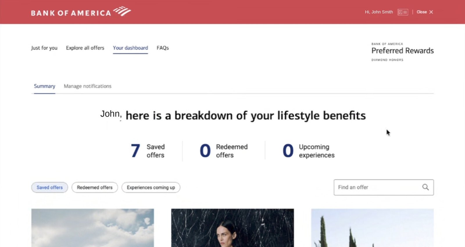
Saved, redeemed and upcoming, then chips to filter between them, its own search field, and its own sub-navigation.
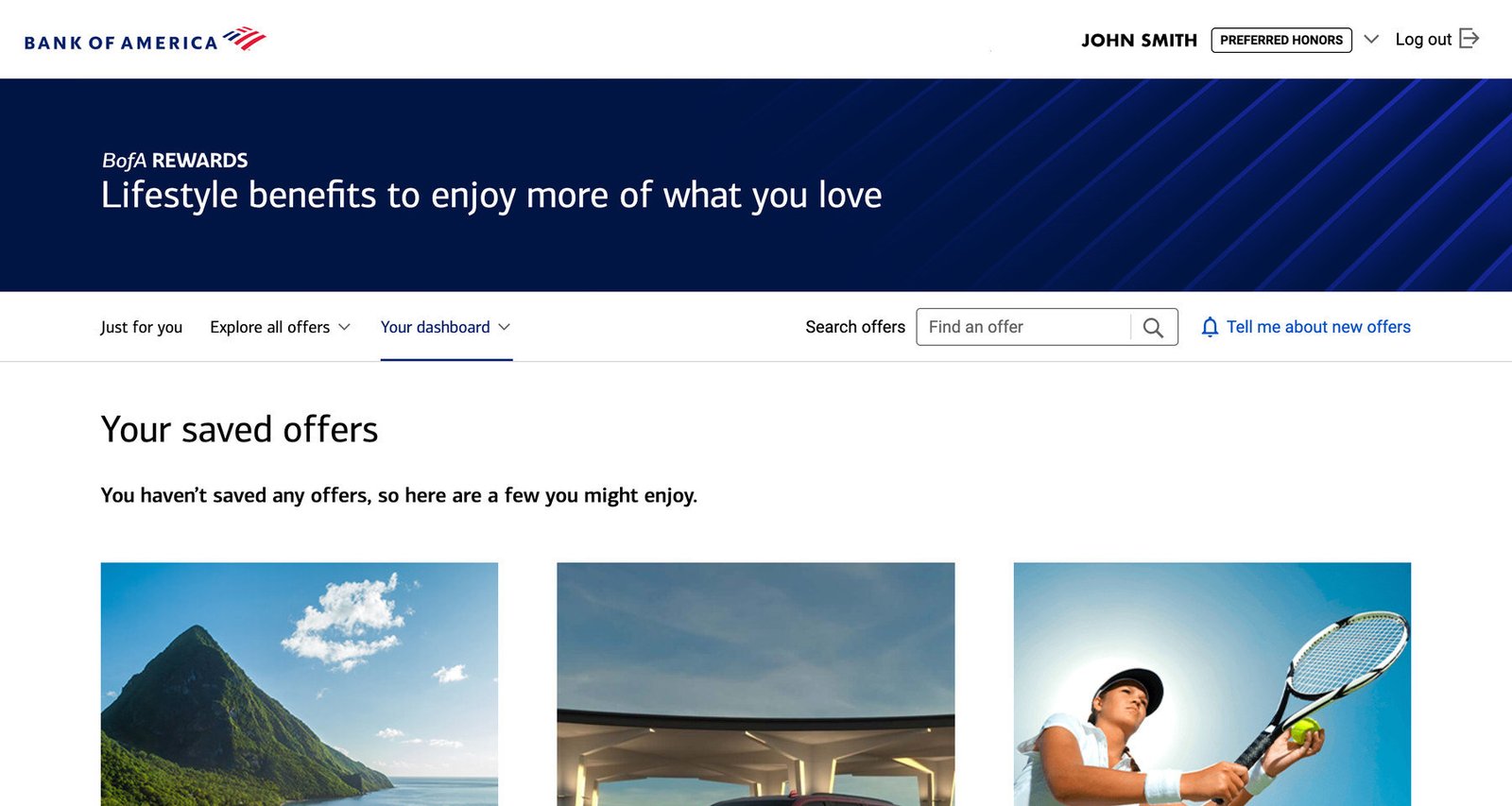
“You haven’t saved any offers, so here are a few you might enjoy.” No counters, no chips, no second search.
For most of the clients the page was about to pick up, all three counters read zero, the chips filtered nothing, and the second search searched an empty list. That’s a thin welcome to a benefit you have just been given. The new page says so in one sentence, then answers it with a few offers worth starting on.
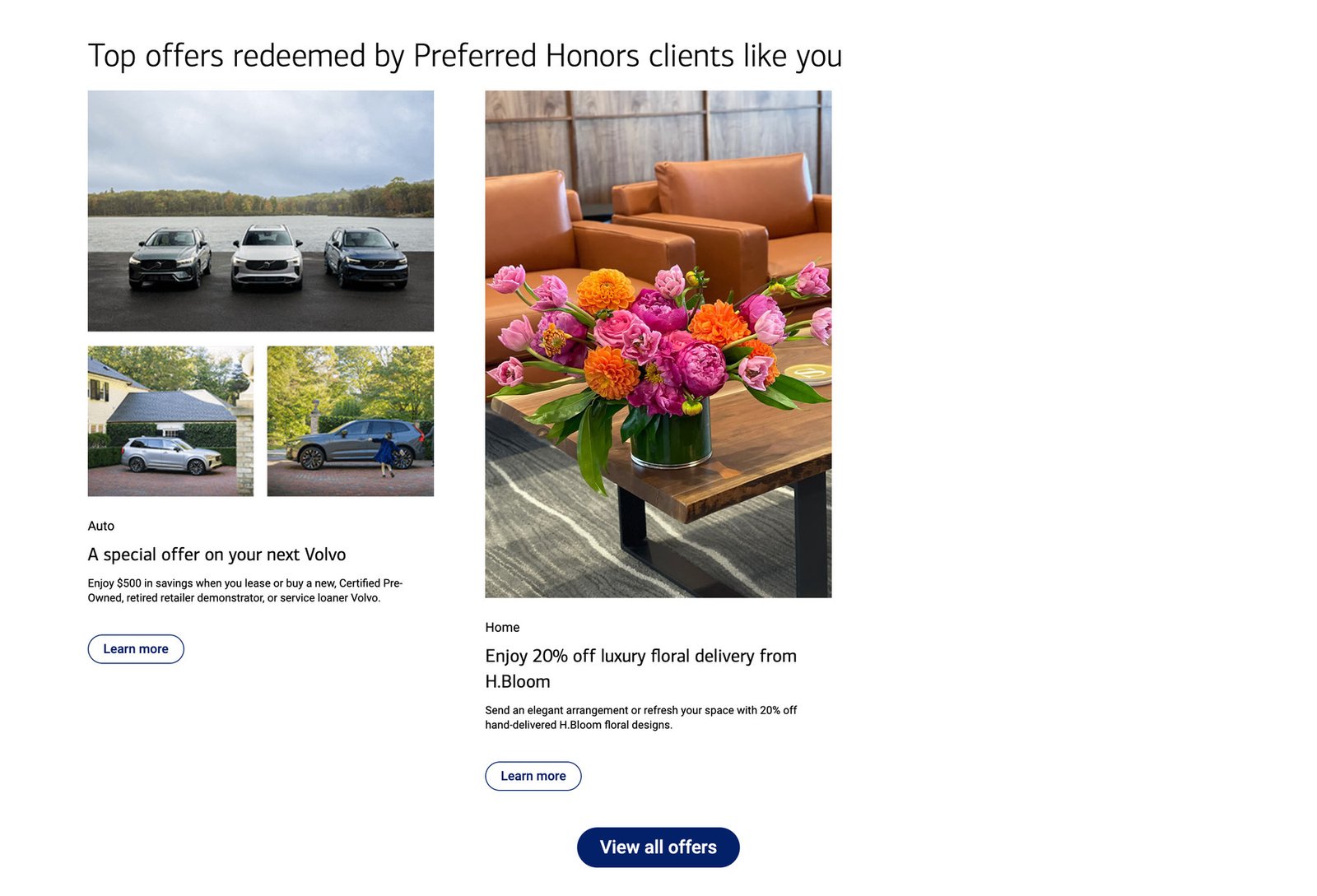
A new client wants to know what do people like me actually use this for, and the second heading answers that by naming their tier. It covers differentiation too: a Premier client sees what Premier clients redeem, not what everyone redeems.
The old page had a single fixed promo banner above the grid. Every seasonal change was a design request.
Now there’s a zone above the grid and one below it. Each takes a few different shapes, depending on what’s running and the time of year. The grid itself doesn’t move.

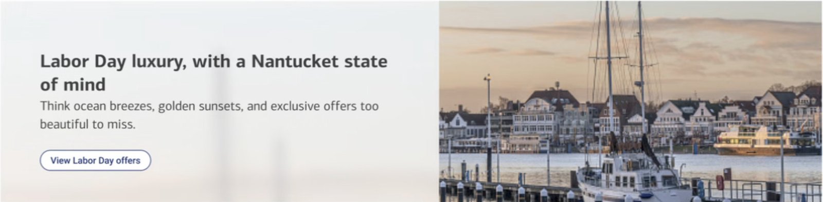
The top zone runs one thing at a time: two offers and a banner for the same category, or a campaign in the slot. Either way, every button lands on Explore all offers, filtered to match.
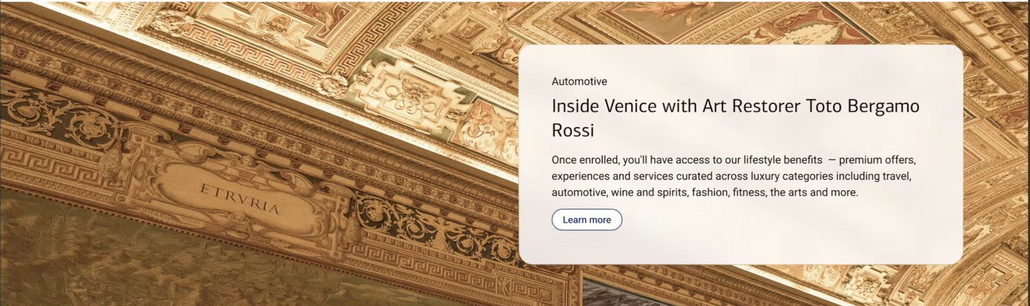
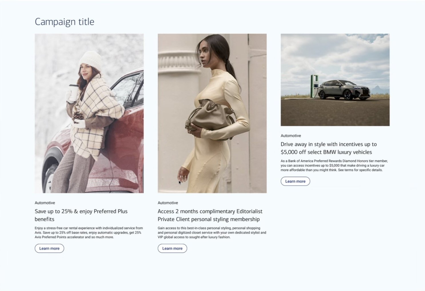

The bigger, image-led shapes go below the grid. Clients who came to browse get the grid first. Clients who scroll all the way down without saving anything get a second chance at the bottom, instead of hitting the FAQs and the footer.
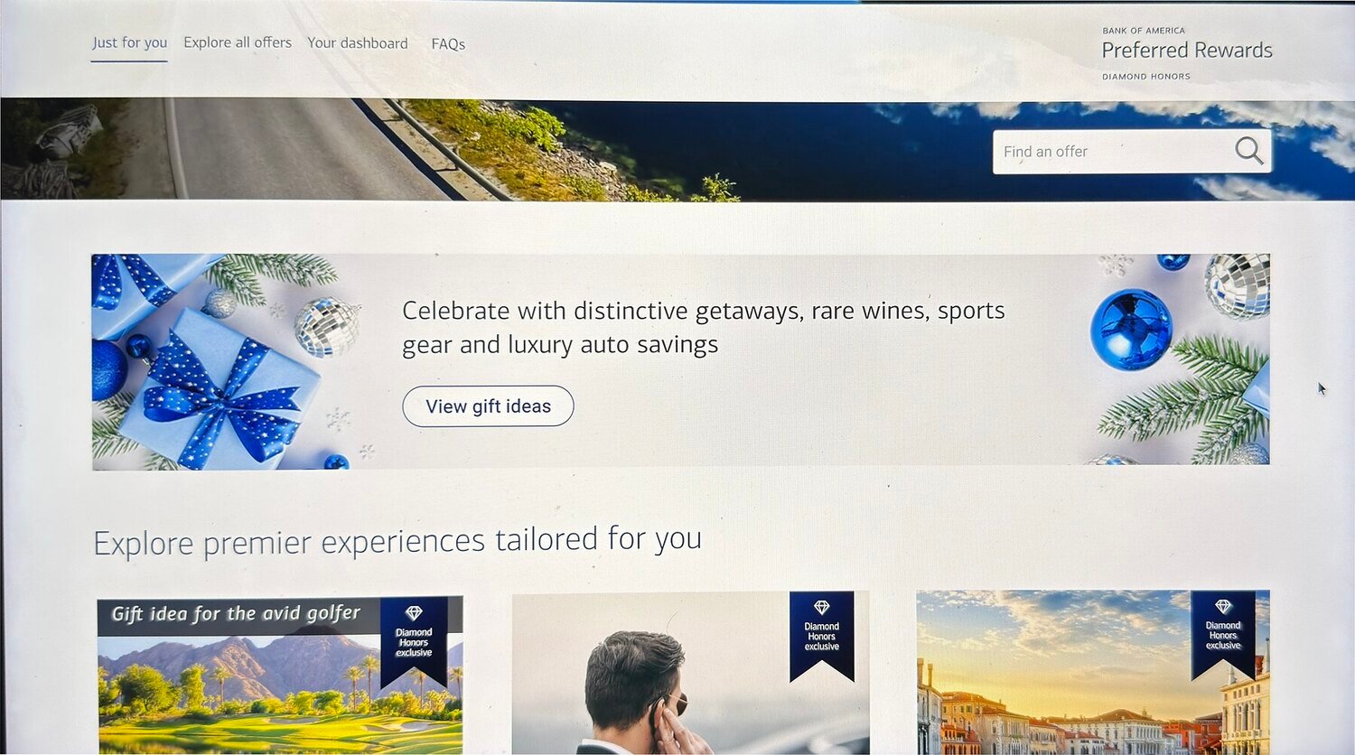
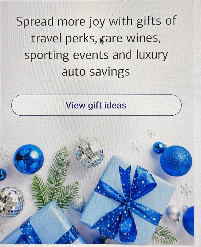
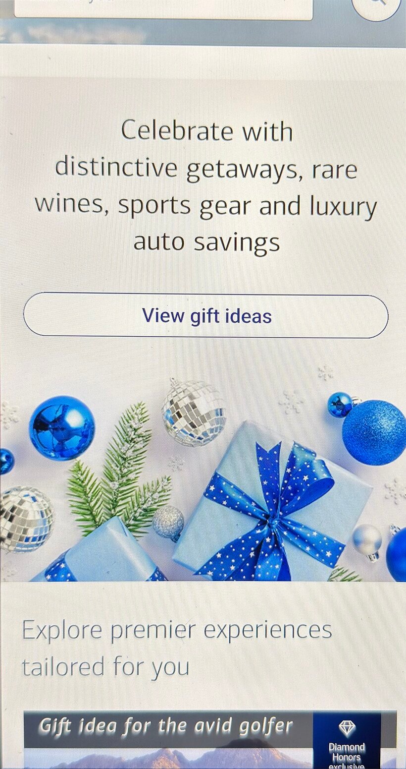
The campaign banner ran the holiday push a season before the expansion shipped, in the same slot above the grid. Desktop sets the copy between two crops of the same photograph; on a phone there is no room for that, so the image moves below the copy and the button whole rather than being squeezed into a strip.
Screen photographs rather than exports, so the type is softer than the artwork it was drawn from.

These are some of the smaller pieces that launched with the rebuild — states, settings, content, and the paths between them.
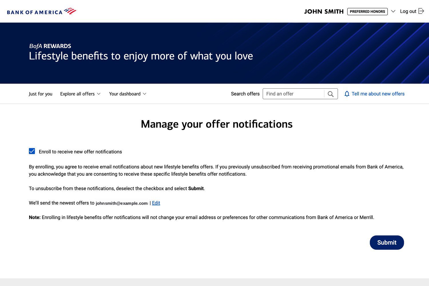
Enrollment and preferences. A monthly notification for new offers, so clients don’t have to remember to come back on their own.
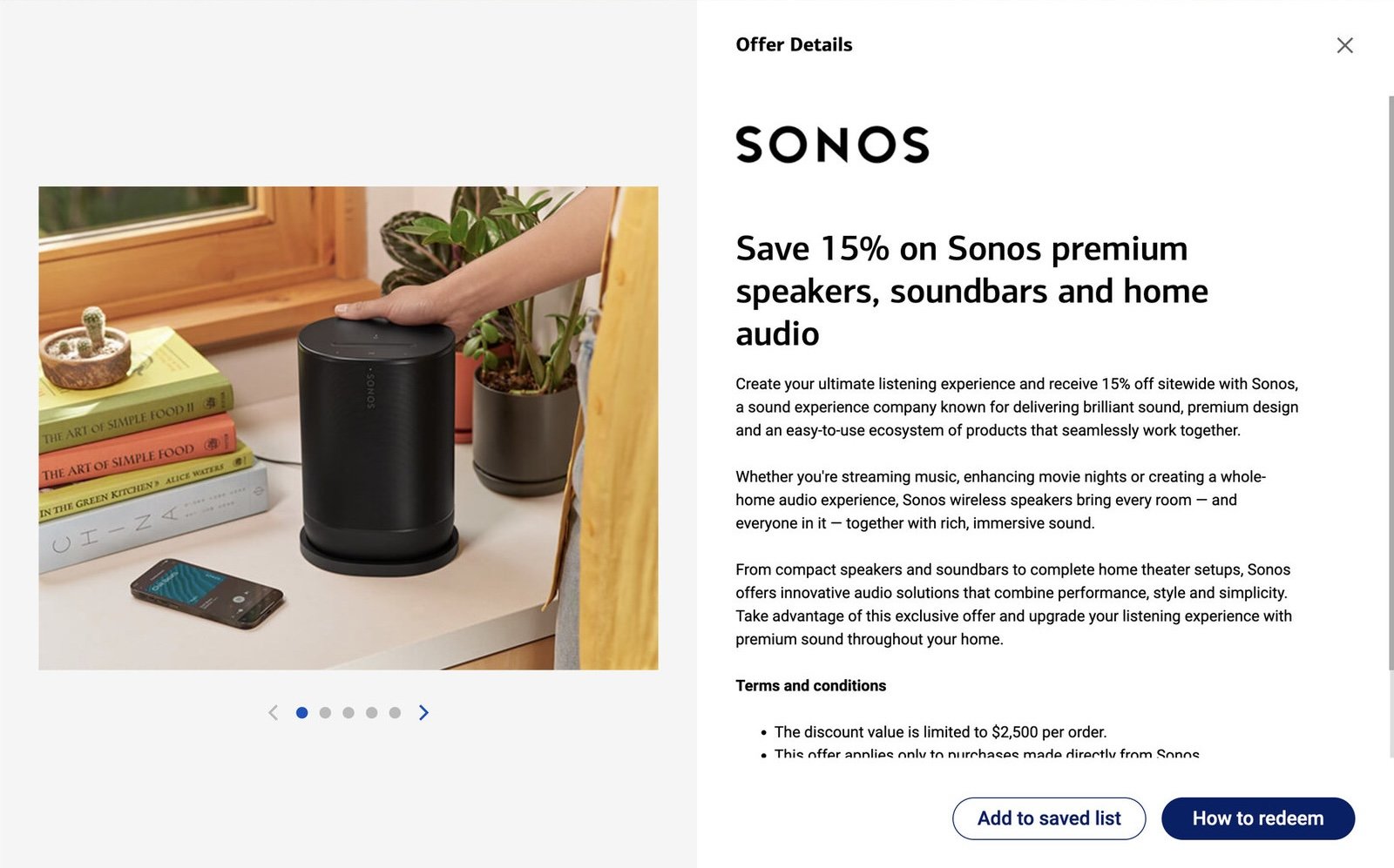
Partner mark, the offer in a sentence, the terms, and the way out. For most offers this is the last screen we control before a client leaves for the partner’s site.
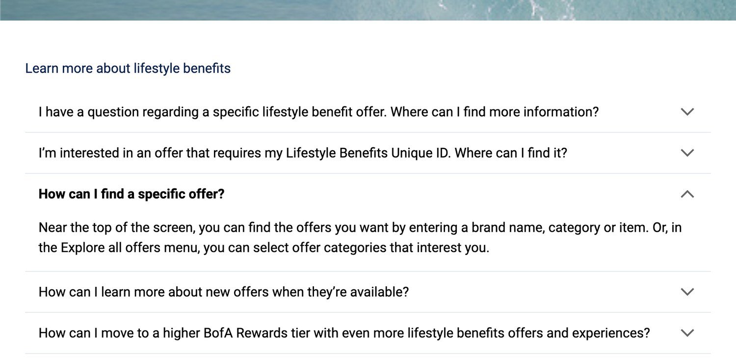
Off the top nav and down to the foot of the page, as an accordion — where a client is more likely to have a question.
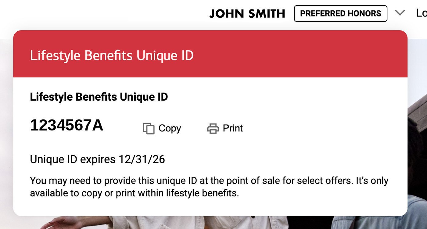
A few offers need a Unique ID at the point of sale. Simplified from a full-page takeover to a dropdown, reachable from anywhere on the site.
The rebuilt page went live in May 2026. It hasn’t been through a full reporting cycle yet. The first numbers that cover it land at the end of this year.
The holiday campaign banners are the exception. They ran a season before the expansion — the pair shown above — and offer clicks for that campaign were up over 75% against the same campaign the year before. That figure belongs to the banners, not to the rebuilt page.
Exclusive only means something next to someone else. A Premier client doesn’t compare this year’s page to last year’s. They compare what they can see to what someone a tier below can see. That is the whole reason the Premier toggle is off by default. Designing the top tier turned out to be mostly about the tier underneath it.
Not everything is a design problem. The offers, the tiers and the $100k cutoff were set before the design work started, and some of the limits around them were technical or commercial rather than design. This project focused on everything downstream of those rules: how the grid read, how the two tiers sat next to each other, and what a client saw on day one with nothing saved. The constraint was the brief, not an obstacle to it.